Les Ateliers Pierre Chaux
Details
Client
Pierre Terre Chaux Maçonnerie proposal not selected
Year
2021
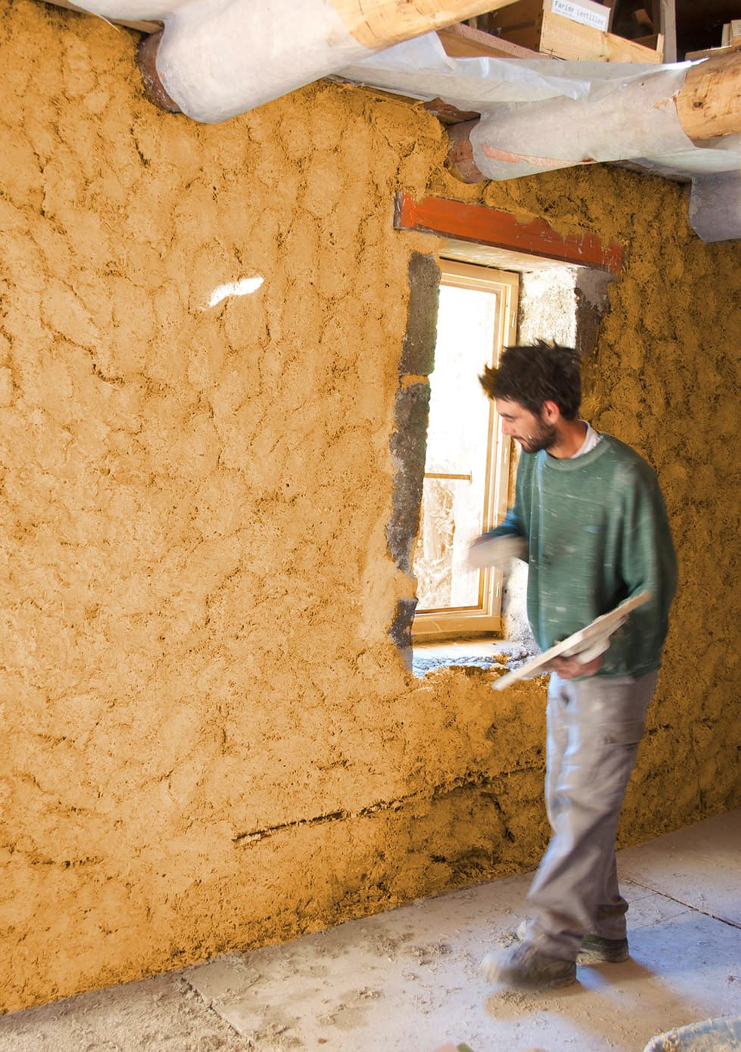
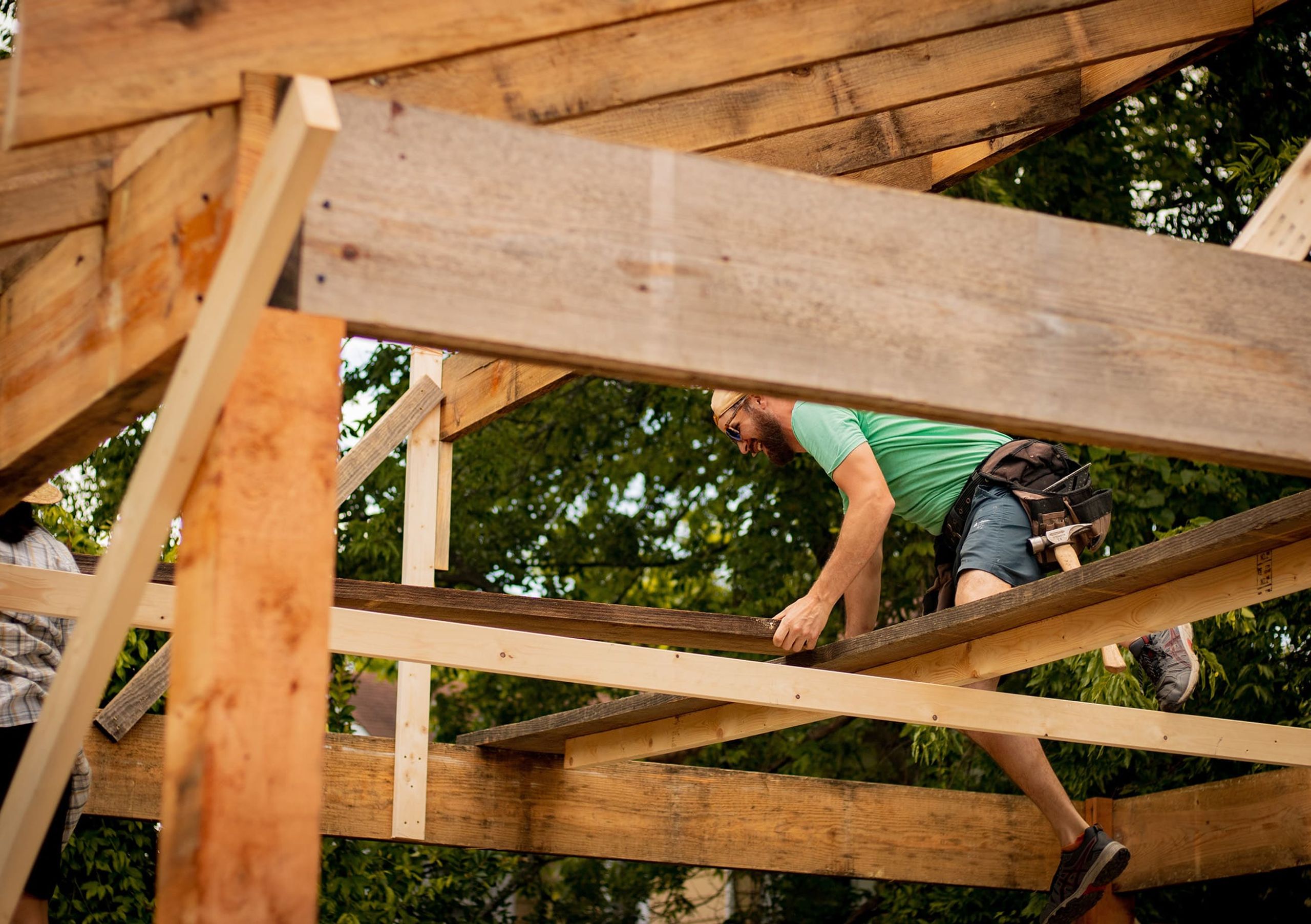
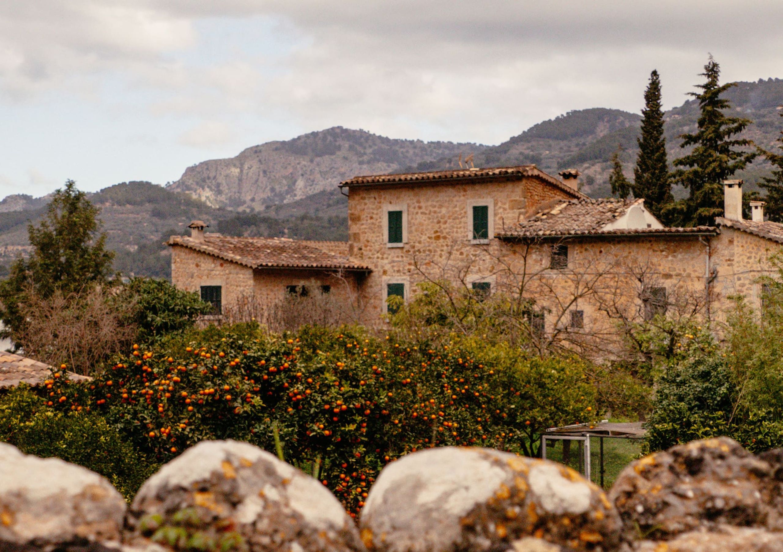
Formerly known as Pierre Terre Chaux Maçonnerie, Ateliers Pierre Chaux has been renovating and rehabilitating ancient buildings in Brittany since 2012. They stand out for their expertise in using traditional techniques with natural materials such as lime, hemp, terracotta, and cut stone, for both residential and heritage sites.
After 10 years, they wanted to redefine their brand identity to better reflect their values.
A New Name for Craftsmanship
To better represent their focus on ecological and traditional building practices, Ateliers Pierre Chaux began their brand transformation with a name change. The old name, "Pierre Terre Chaux Maçonnerie", evoked conventional masonry without any reference to ancient building traditions or ecological values. Thus, the name failed to distinguish Ateliers Pierre Chaux from their competitors. "Atelier" then marks an identity rooted in craftsmanship, associated with the natural materials of stone and lime.
In coherence with a more pronounced positioning in their values, the visual identity of Les Ateliers needed to be redesigned. It should embody a respectful know-how of traditional techniques as well as a natural dimension.
The Letter and the Sign
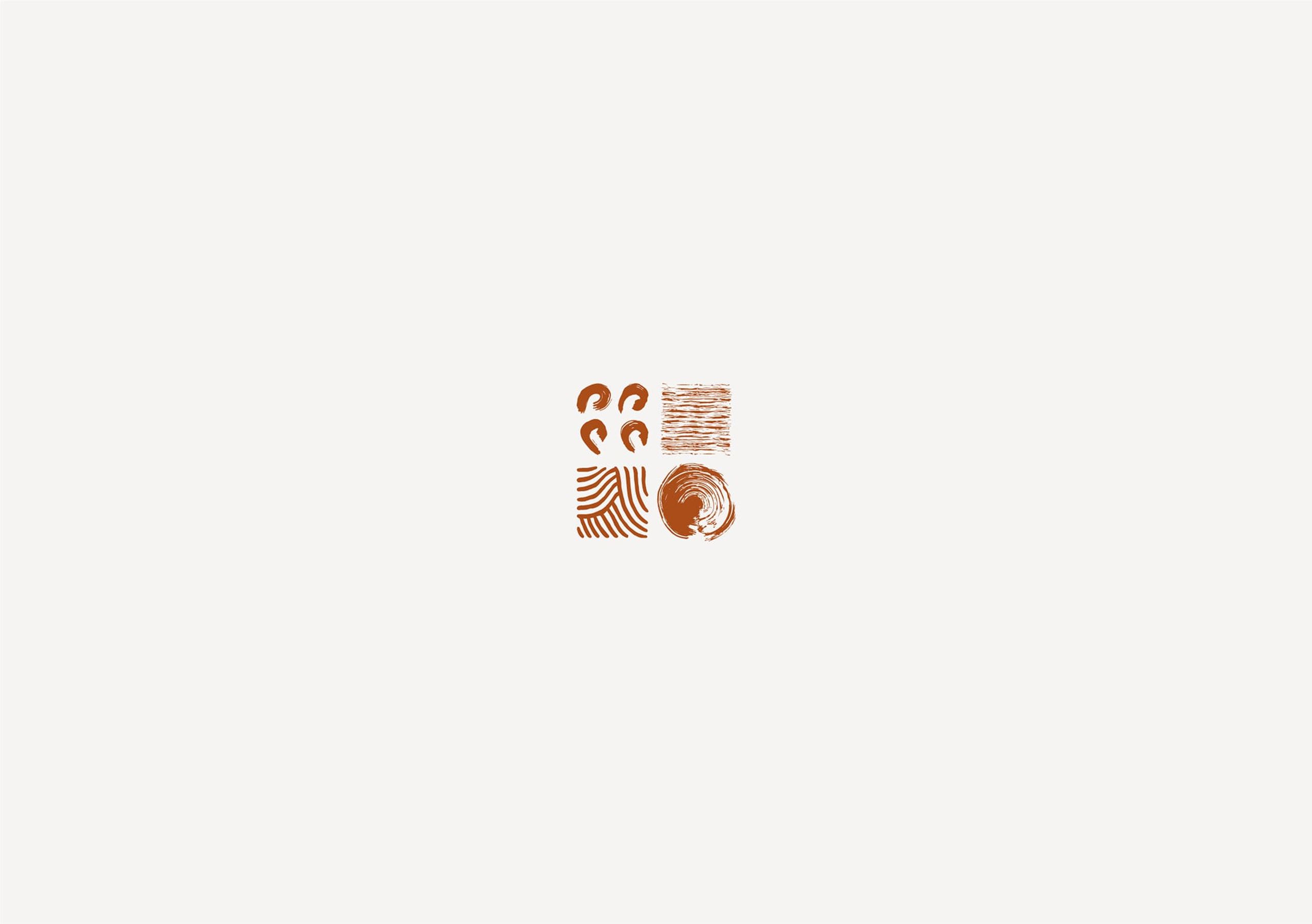
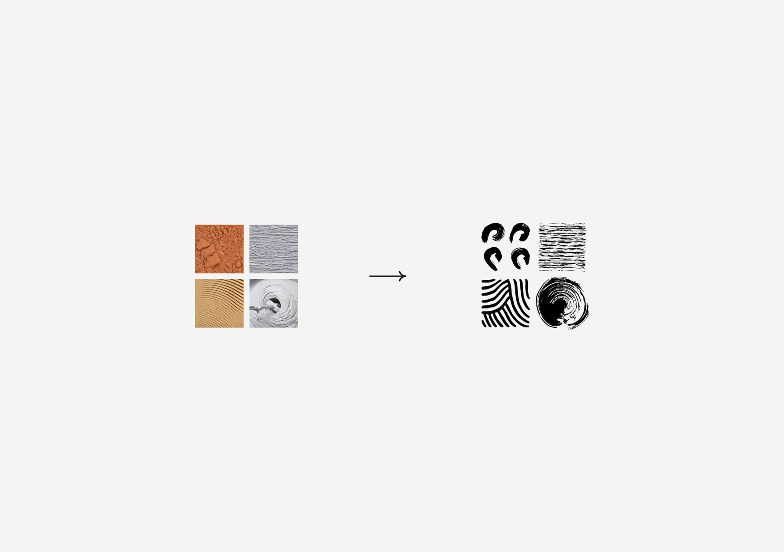
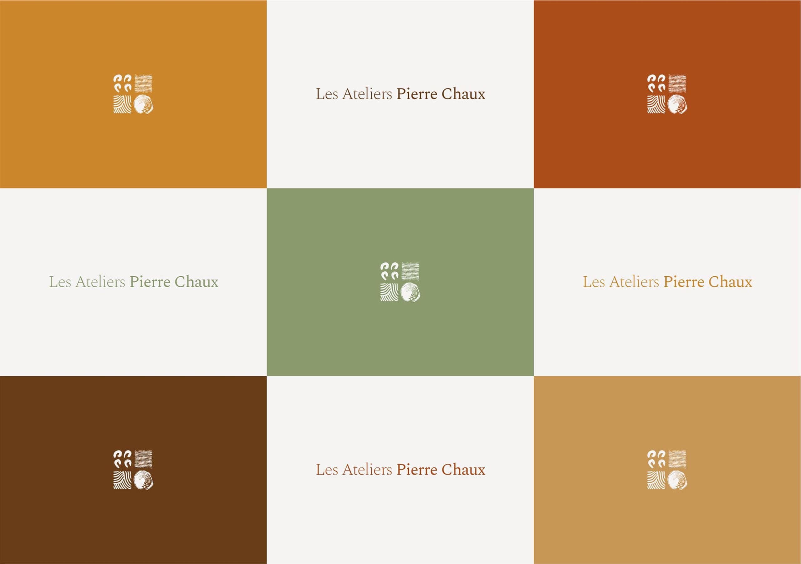
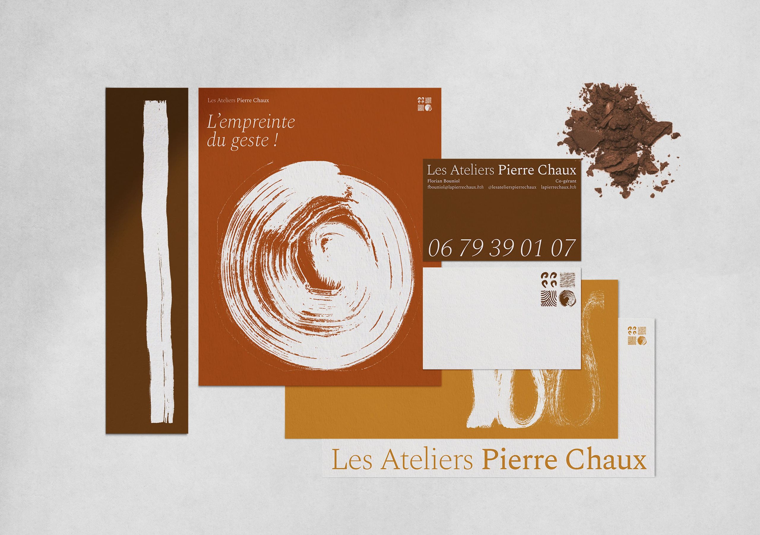
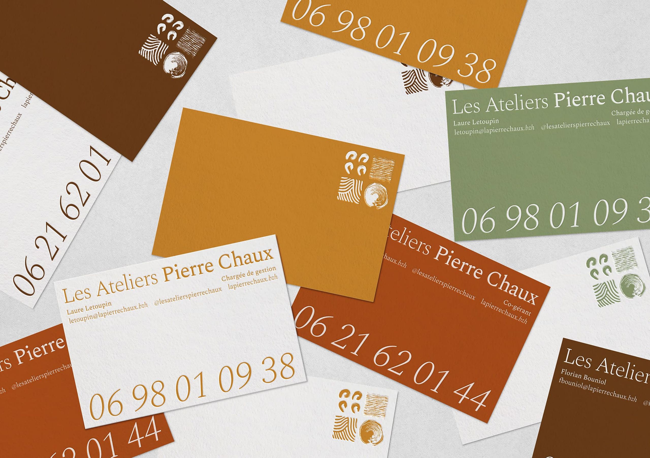
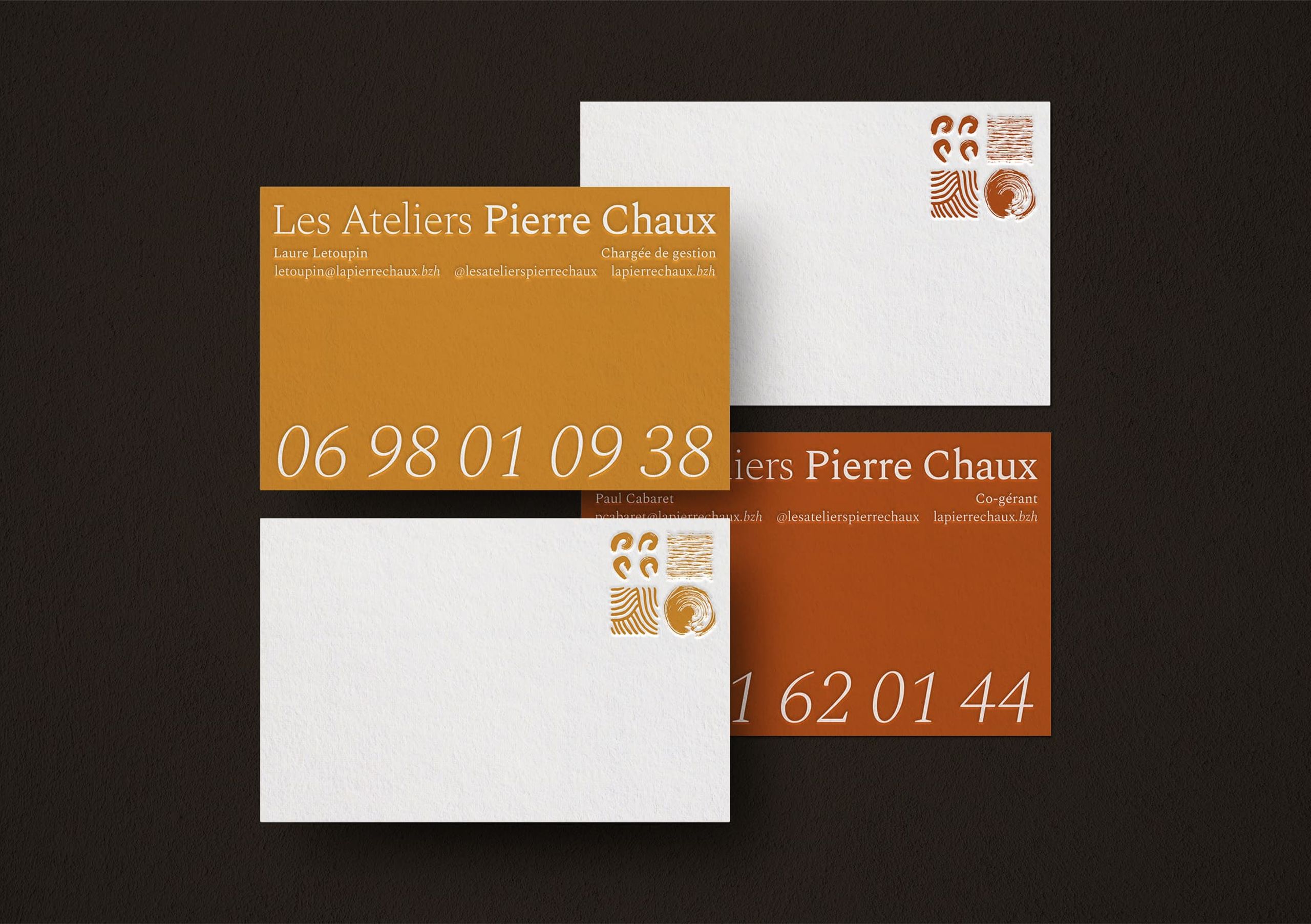
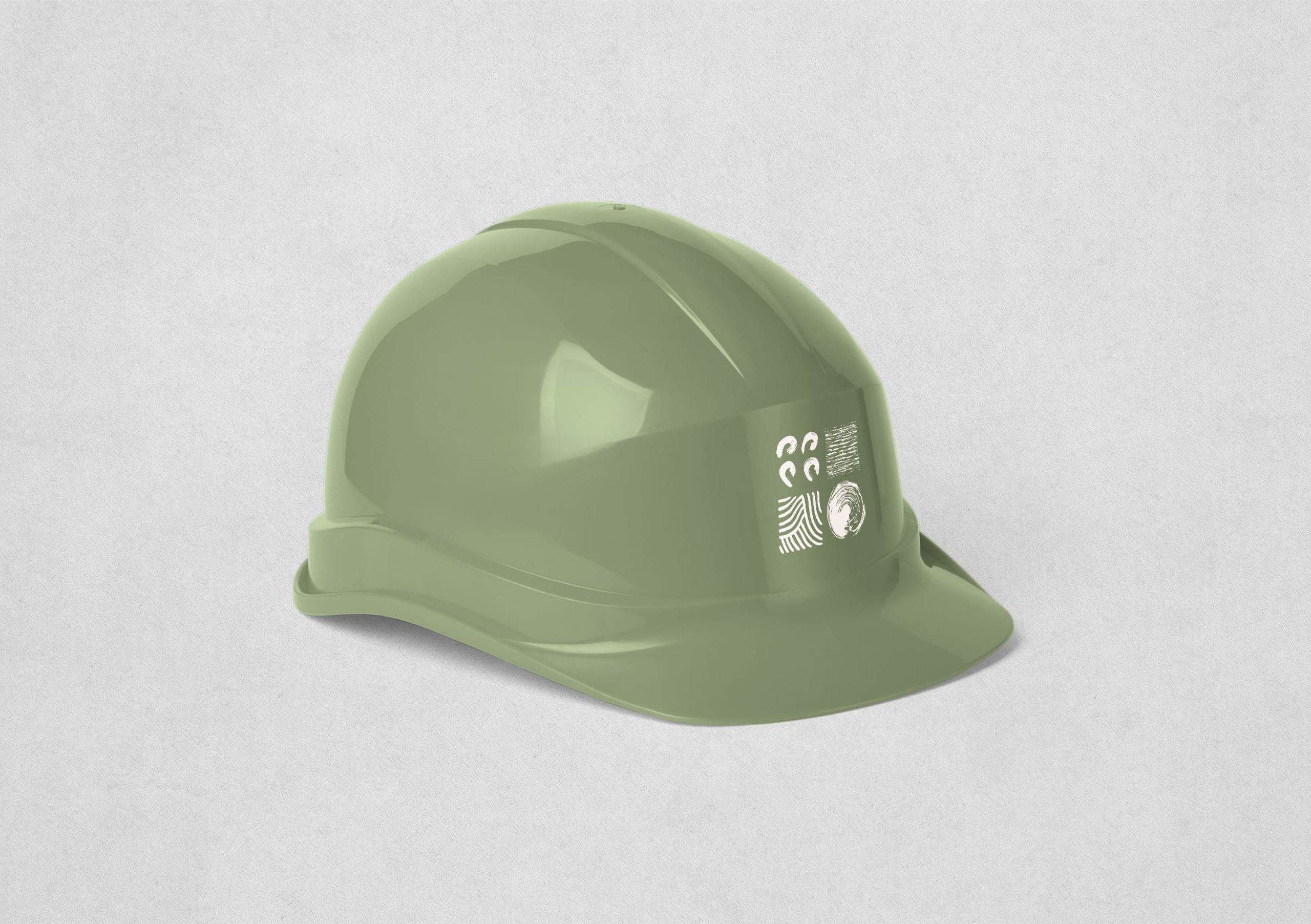
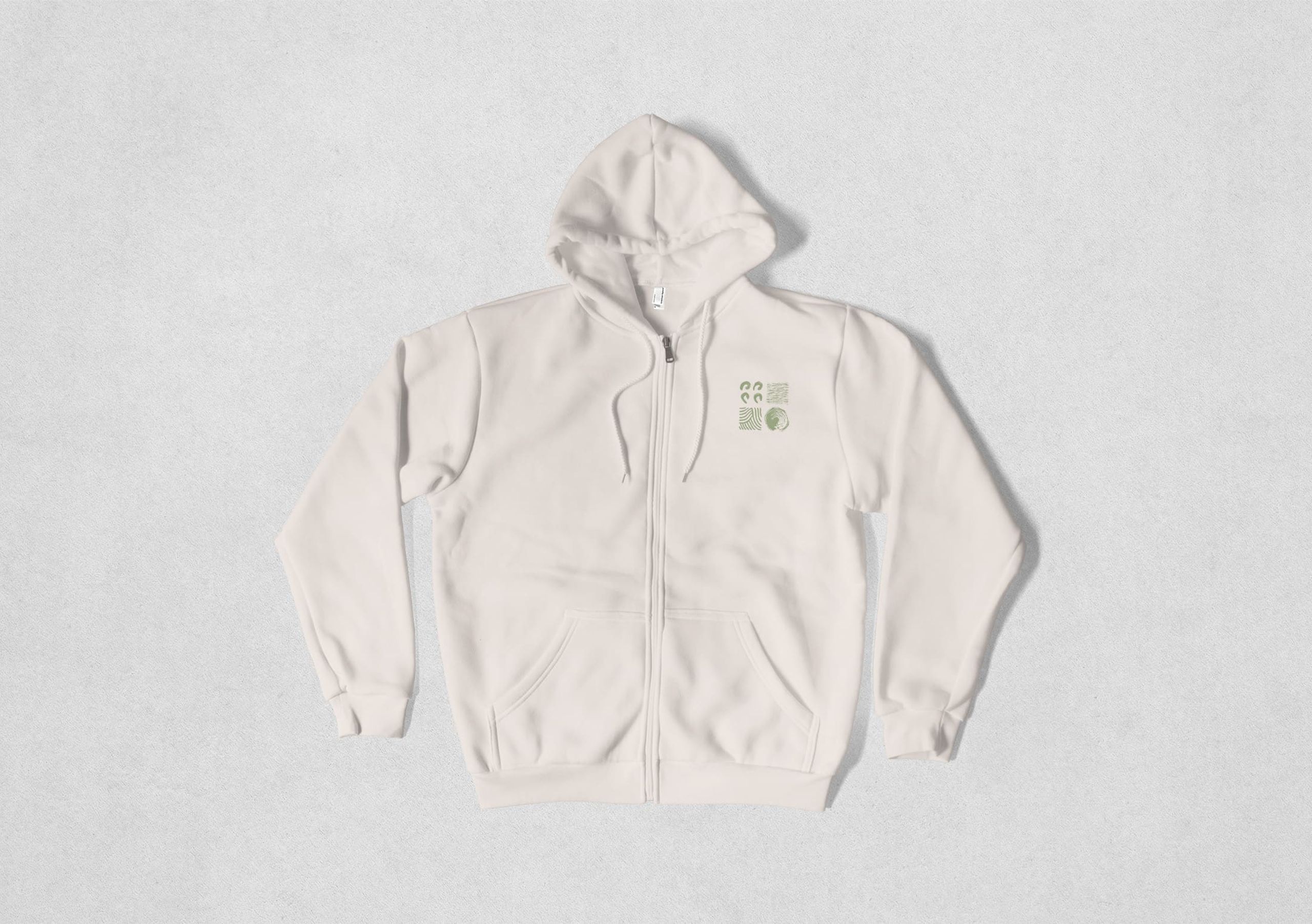
The new visual identity is based on two elements: a stable and elegant lettering that conveys solidity and durability, and a distinctive graphic element inspired by the various materials used in their craft. Four graphic blocks, arranged like cut stones, symbolise the pillars of craftsmanship, tradition, comfort, and ecology.
The Art of Gesture
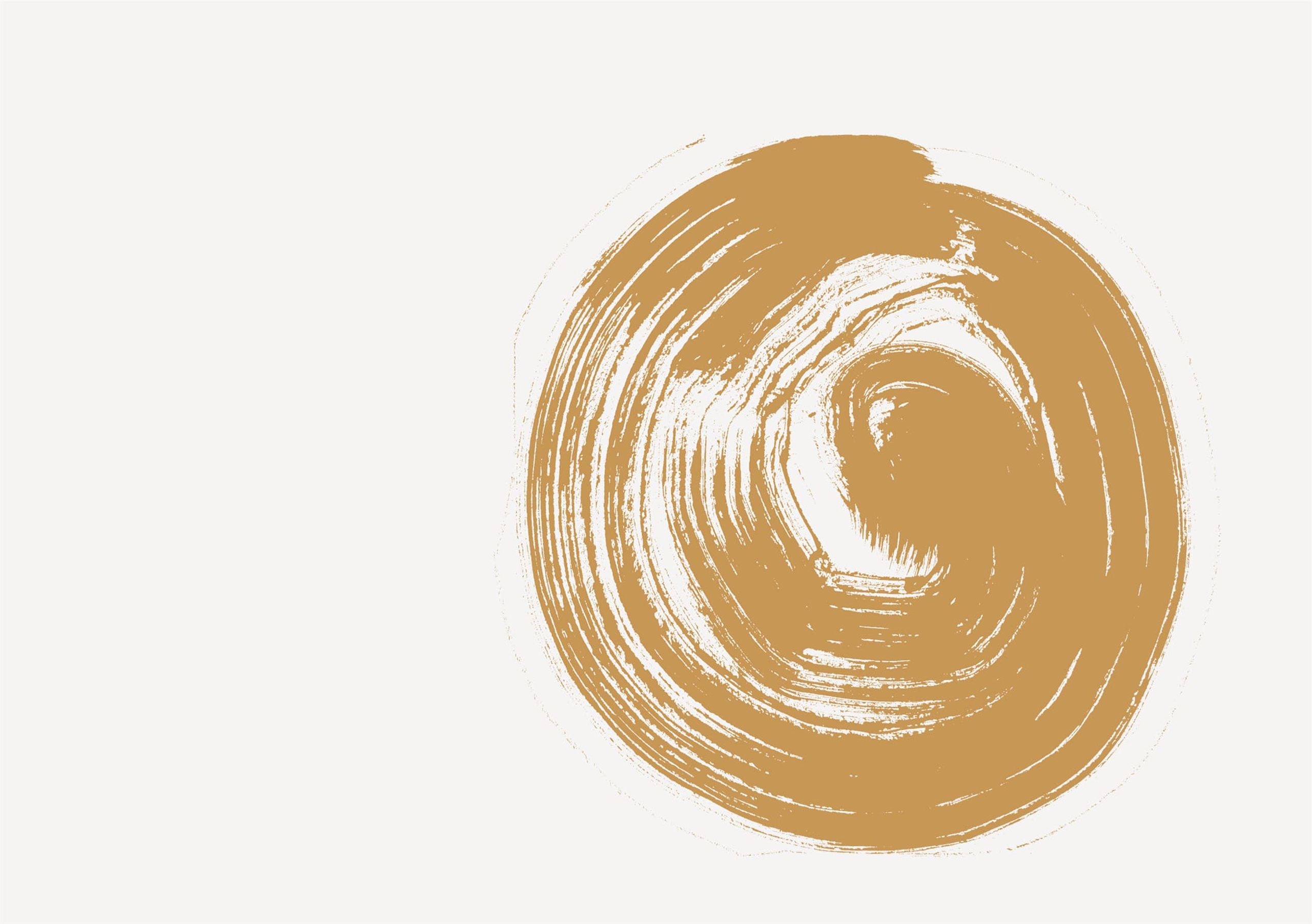
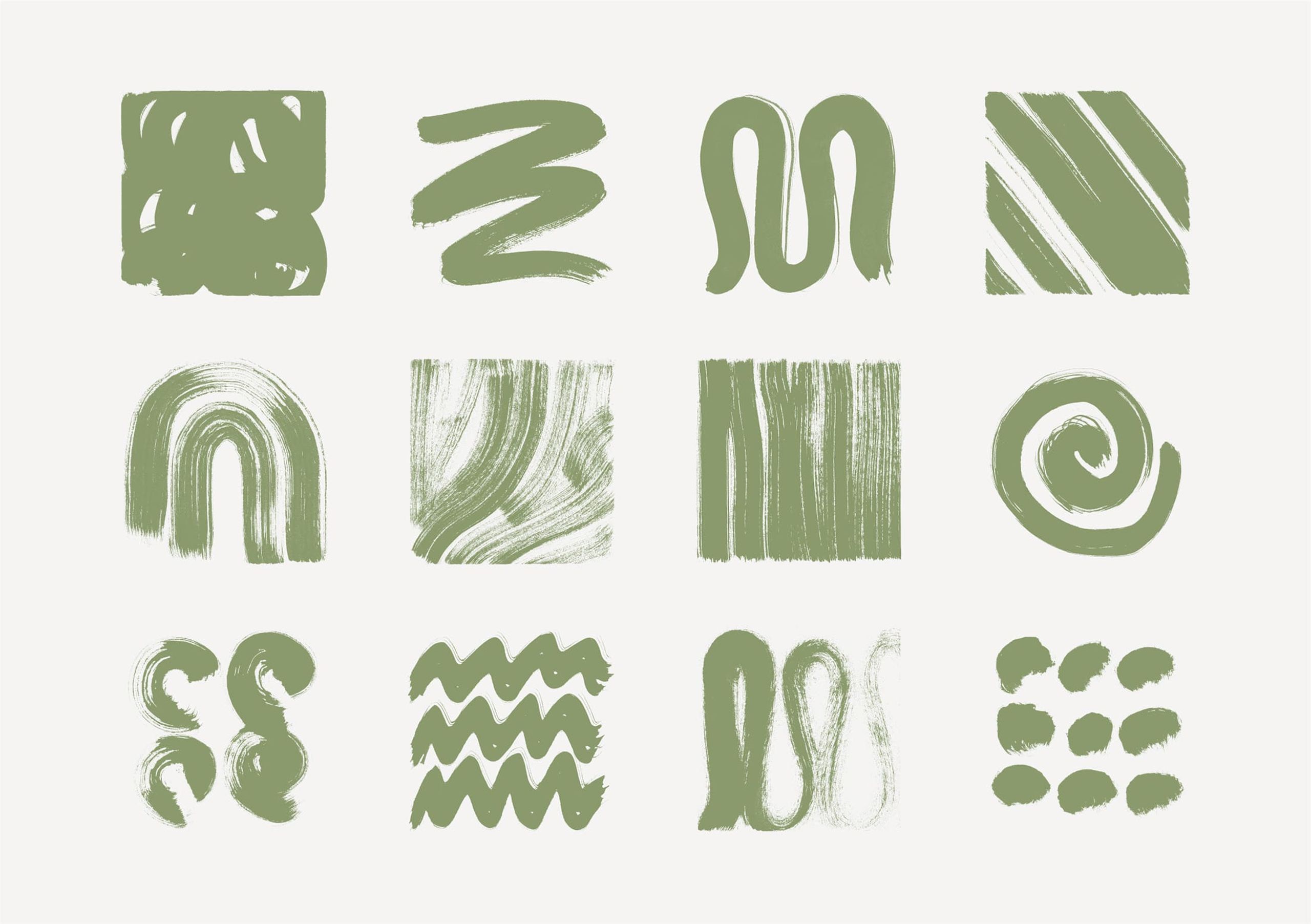
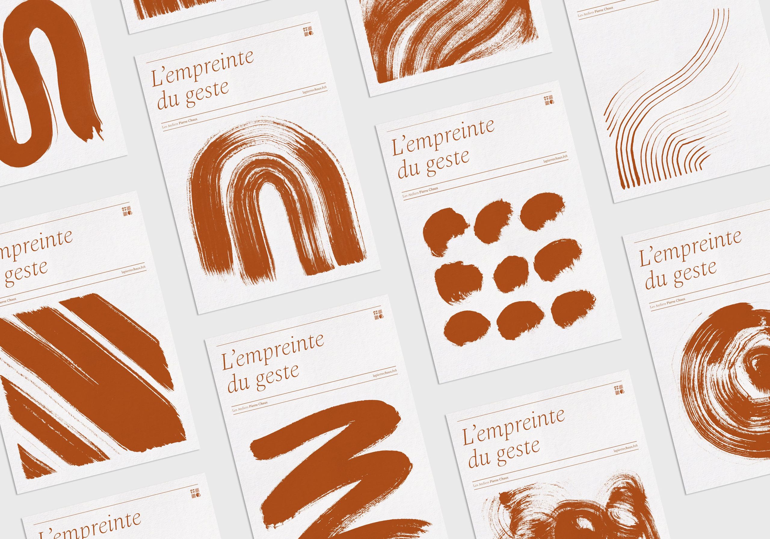
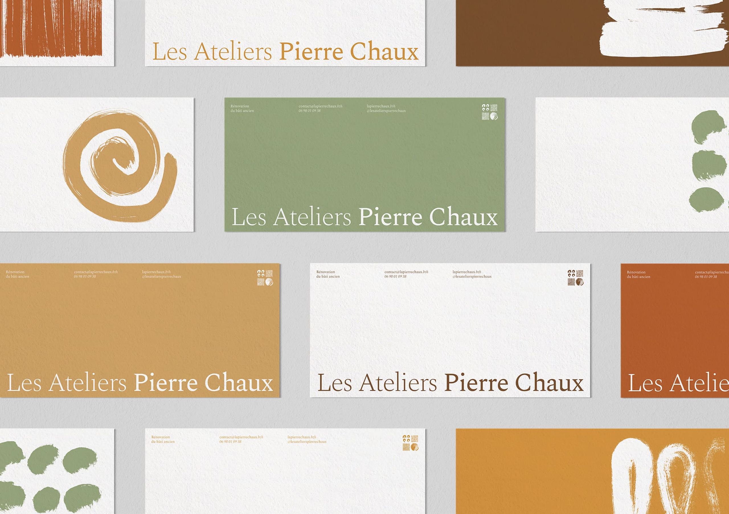
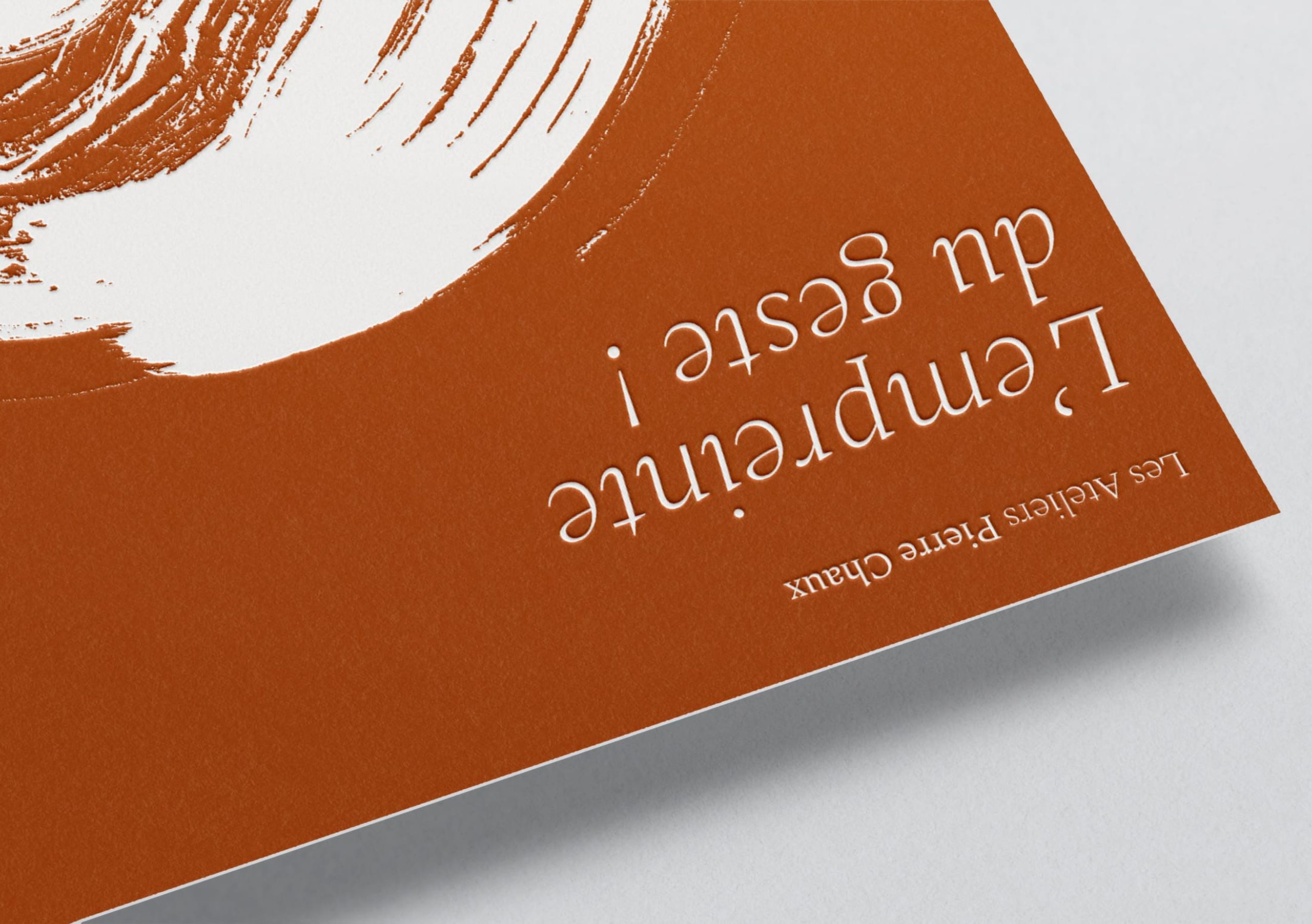
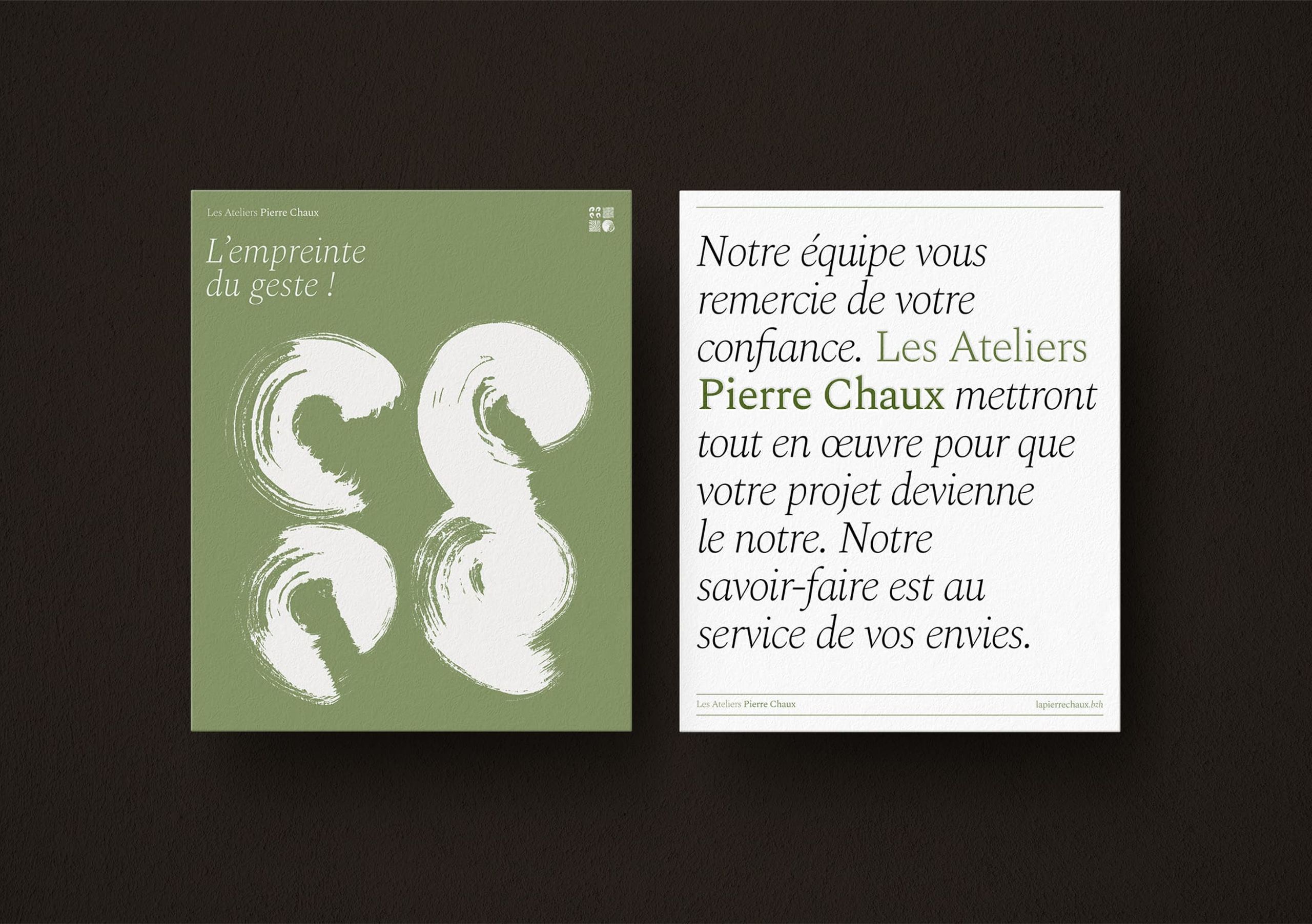
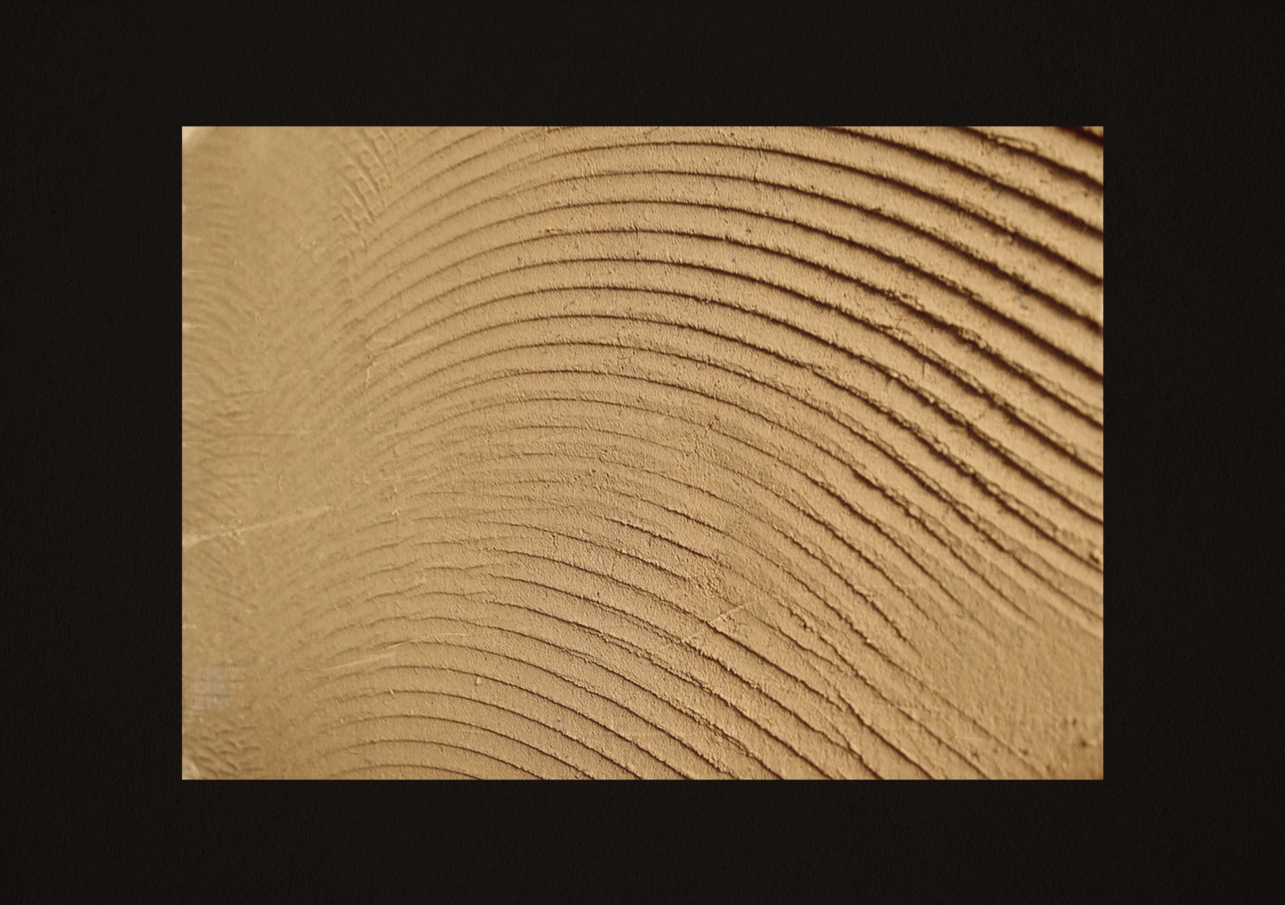
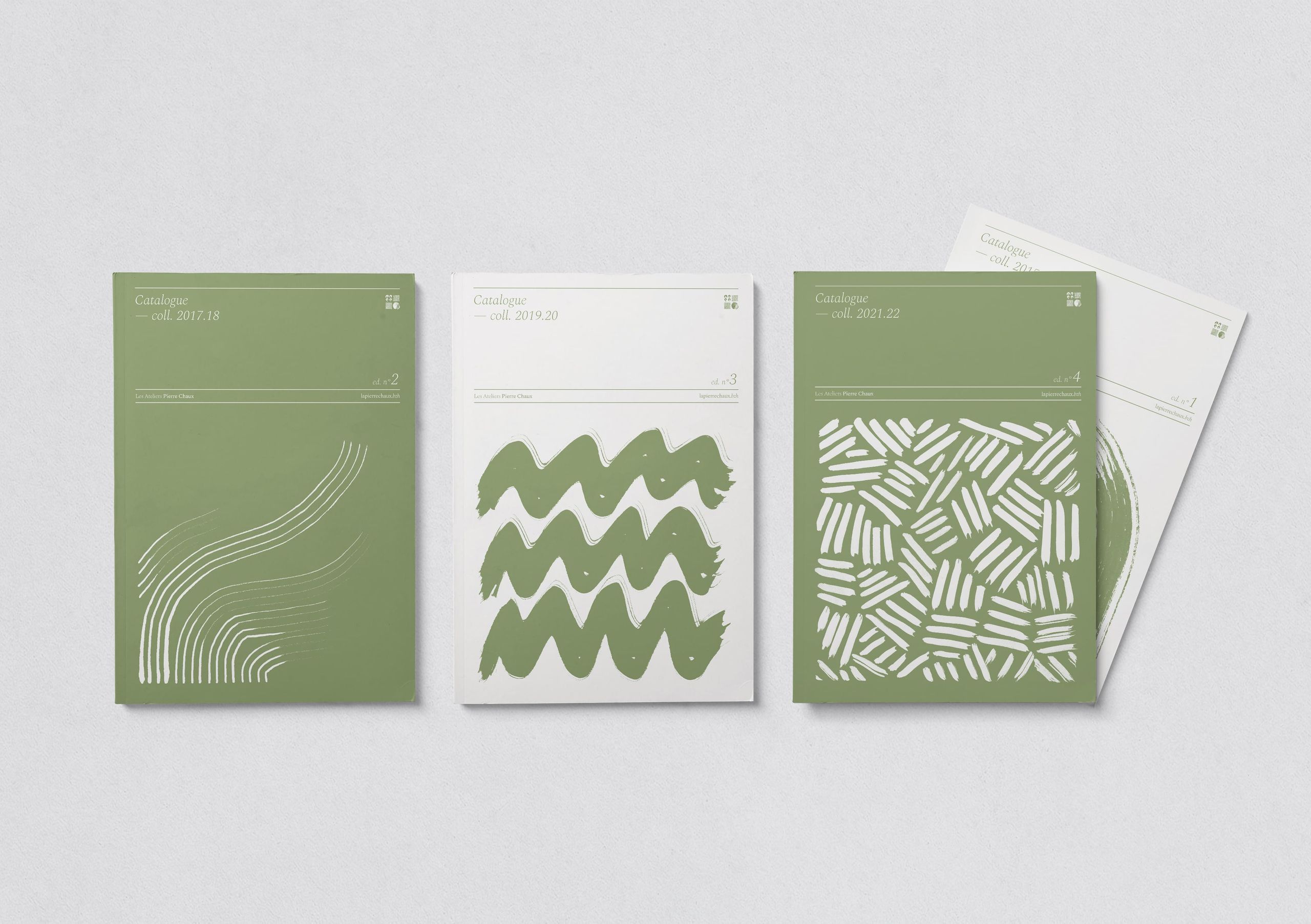
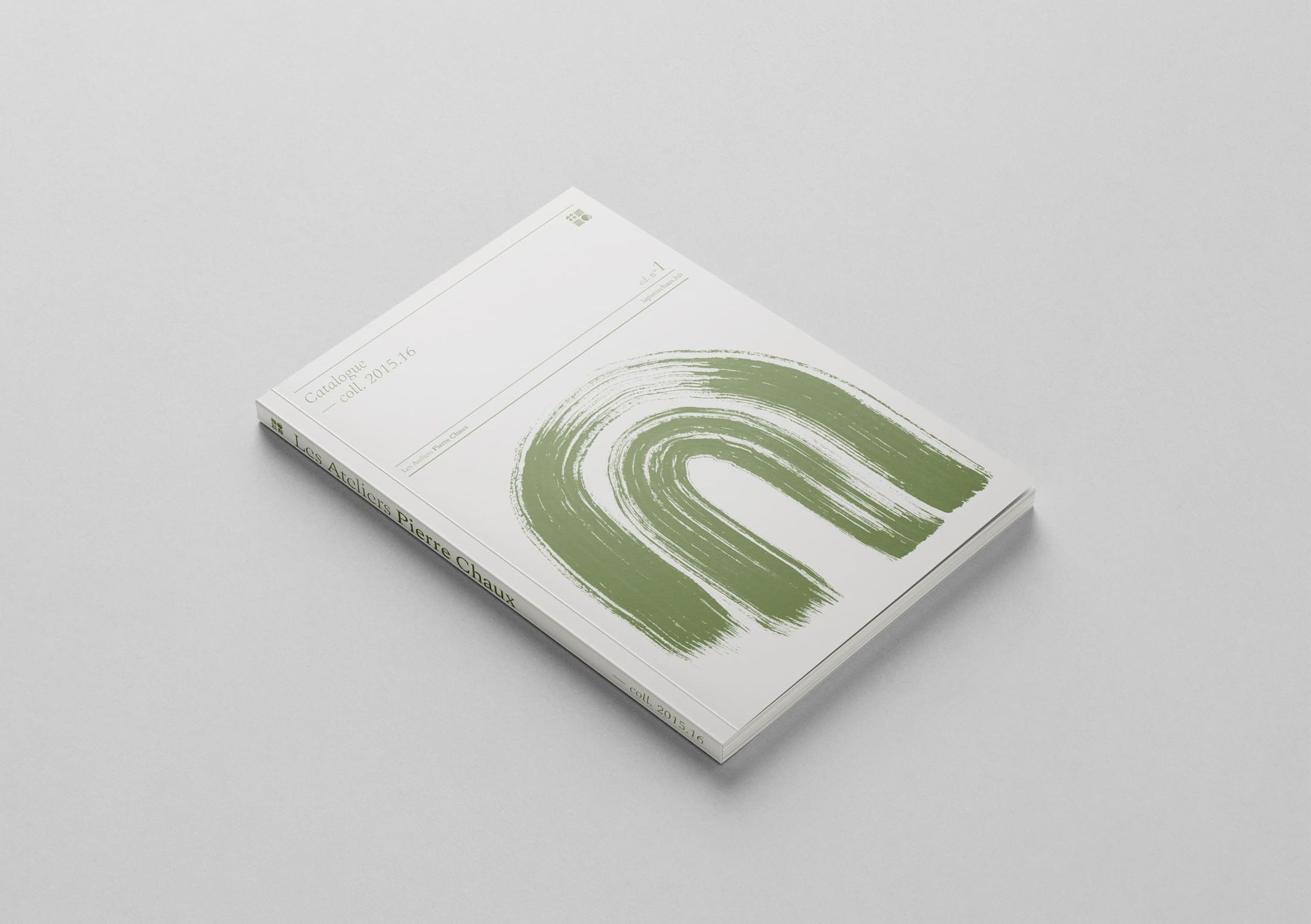
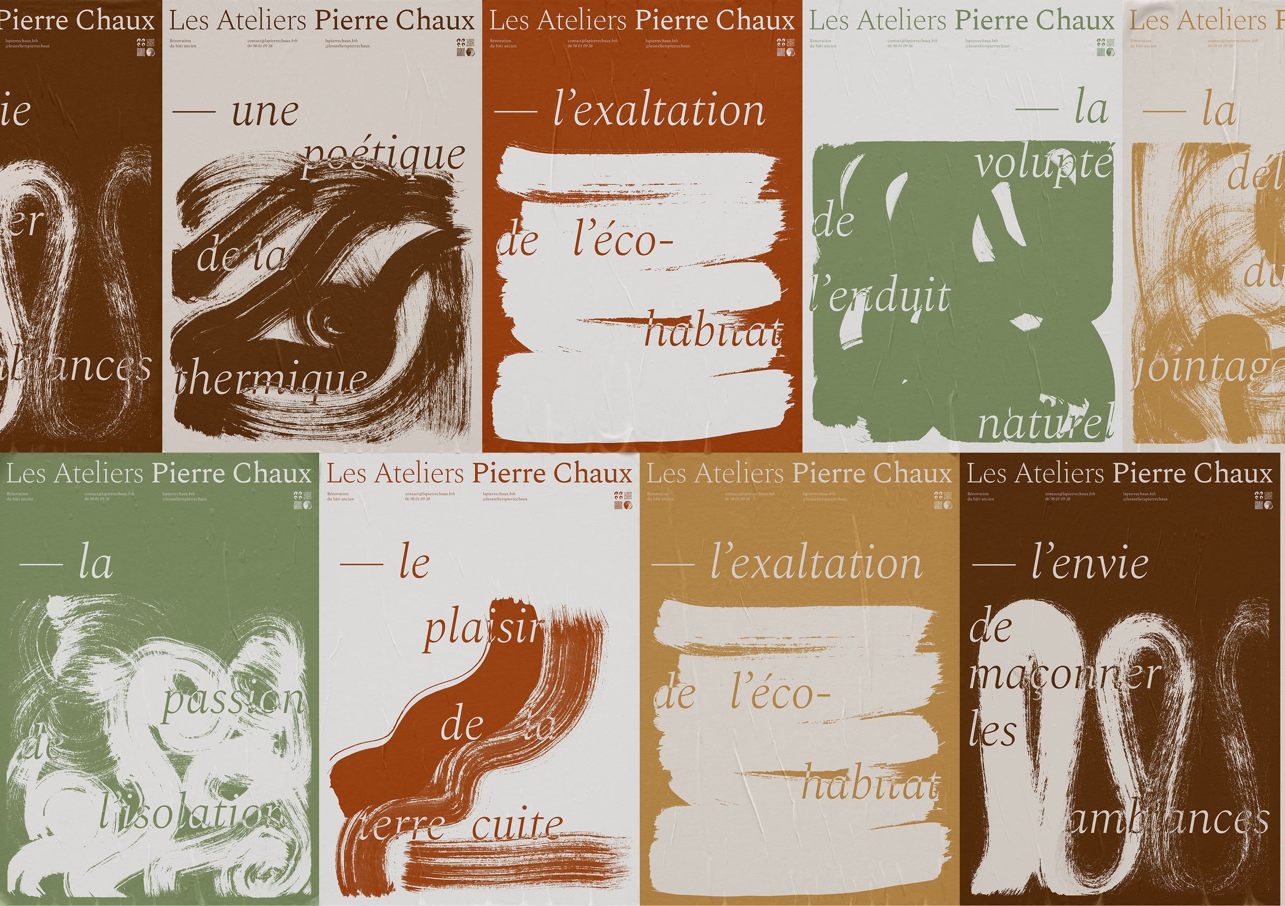
To enrich the visual identity, a hand-drawn graphic vocabulary has been developed inspired by the craft of APC. The ink-drawn textures express the various techniques and processes used in their construction projects, and evoke the formal aspect of the materials at the heart of their work. The raw brushstrokes give a sense of the roughness and irregularity of the materials, and highlight the authenticity of the handmade work. These forms can be used as patterns on various communication media.
Natural and Vegetal Palette
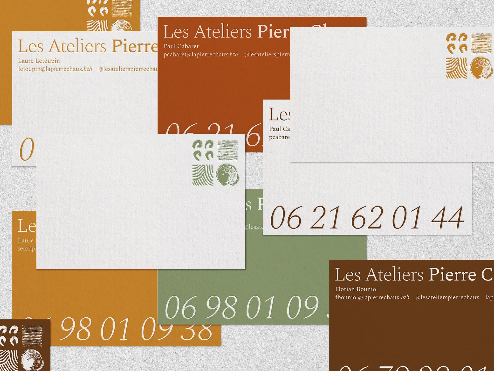
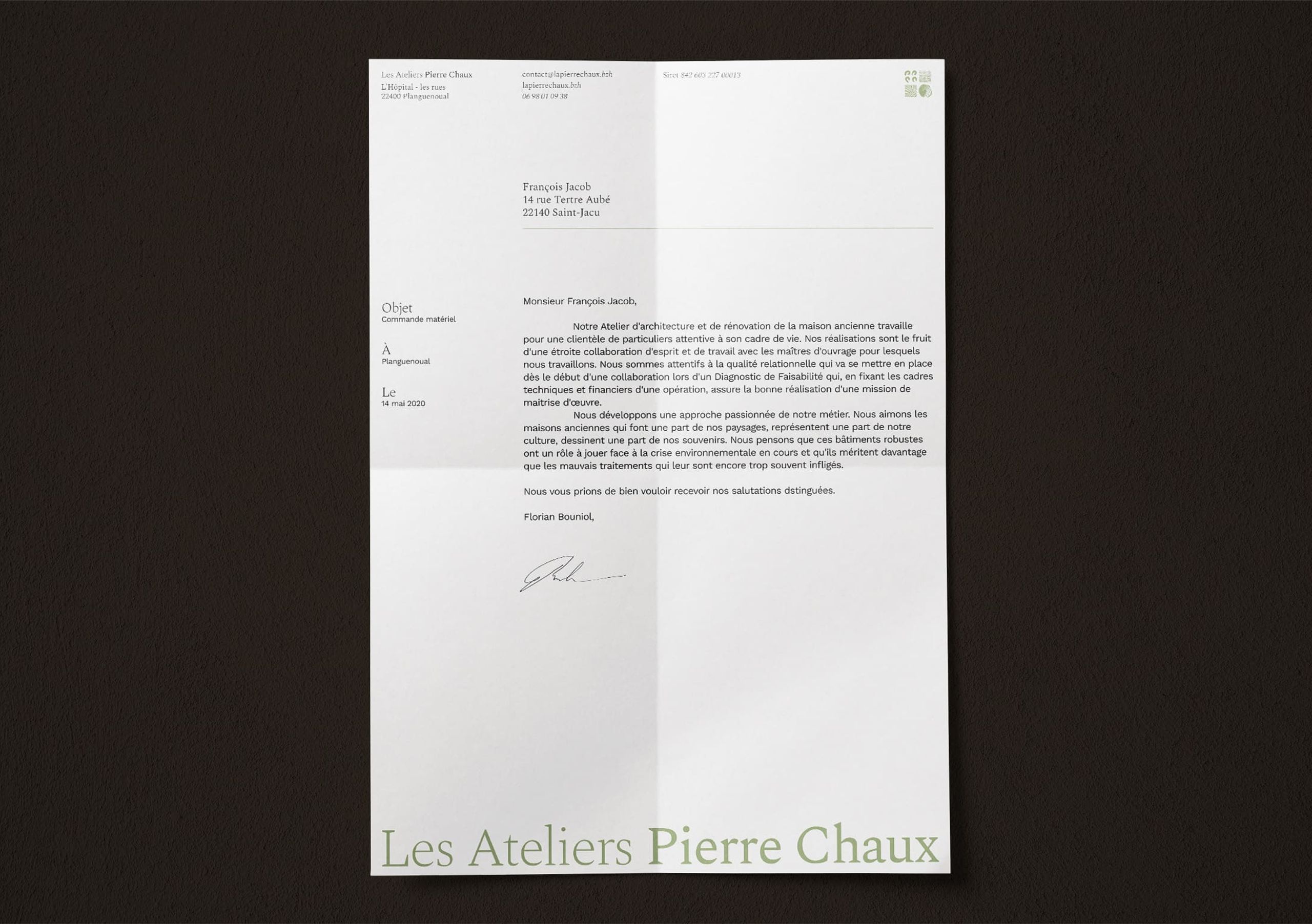
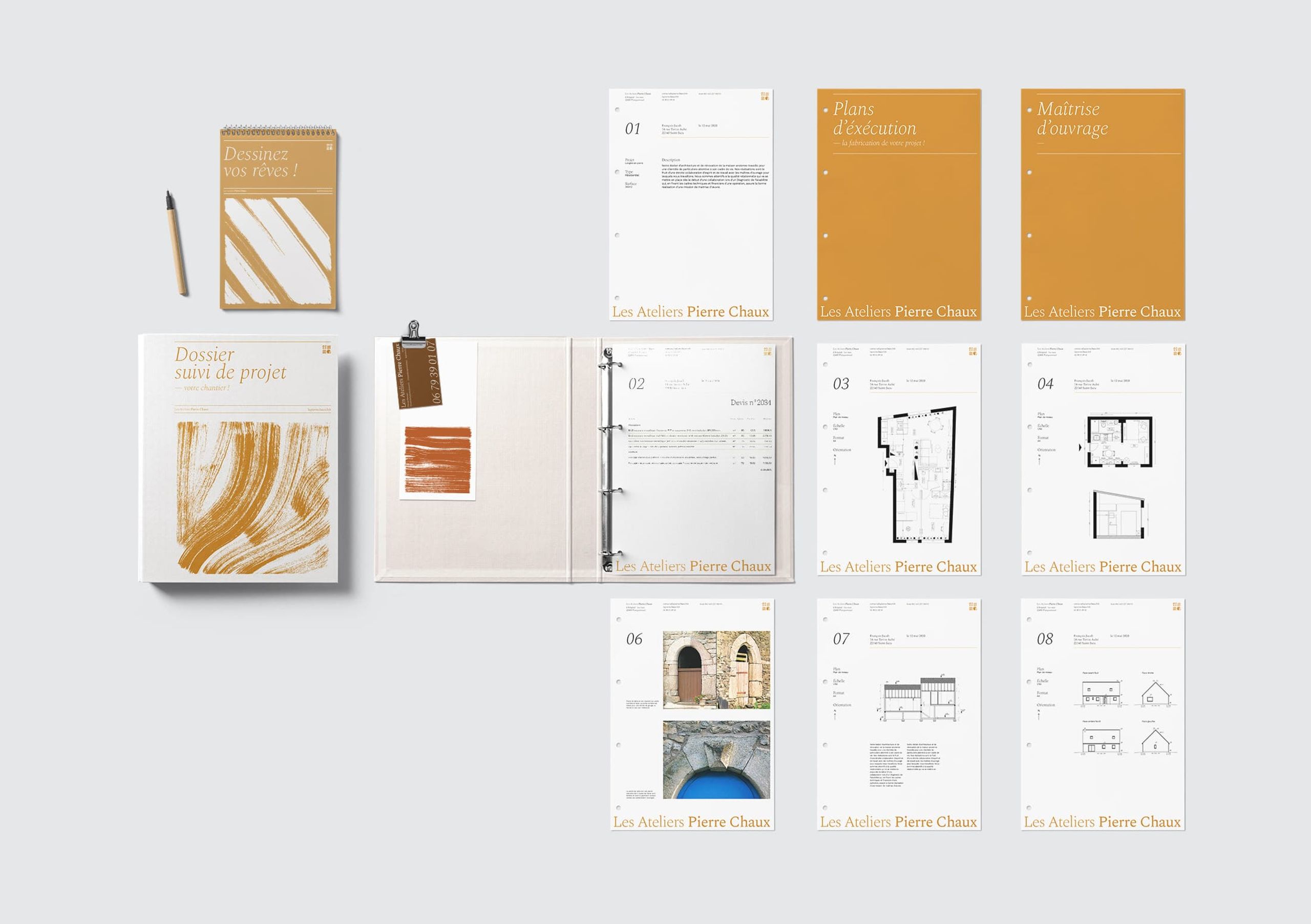
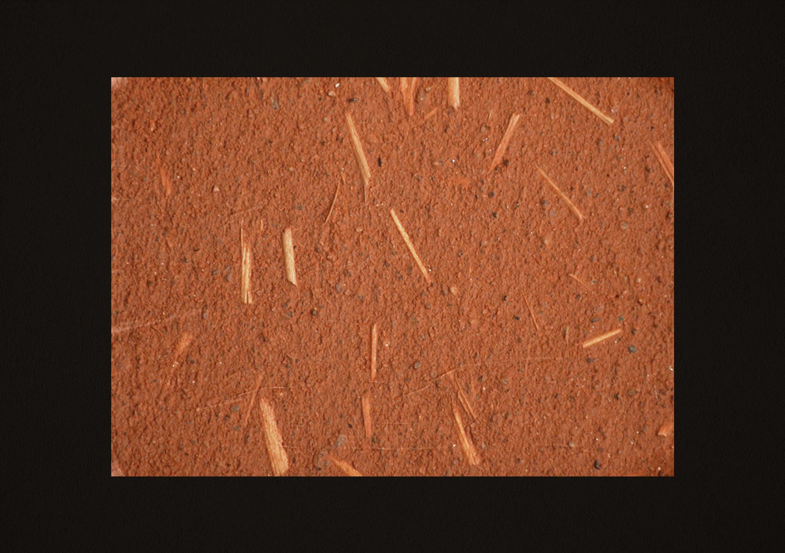
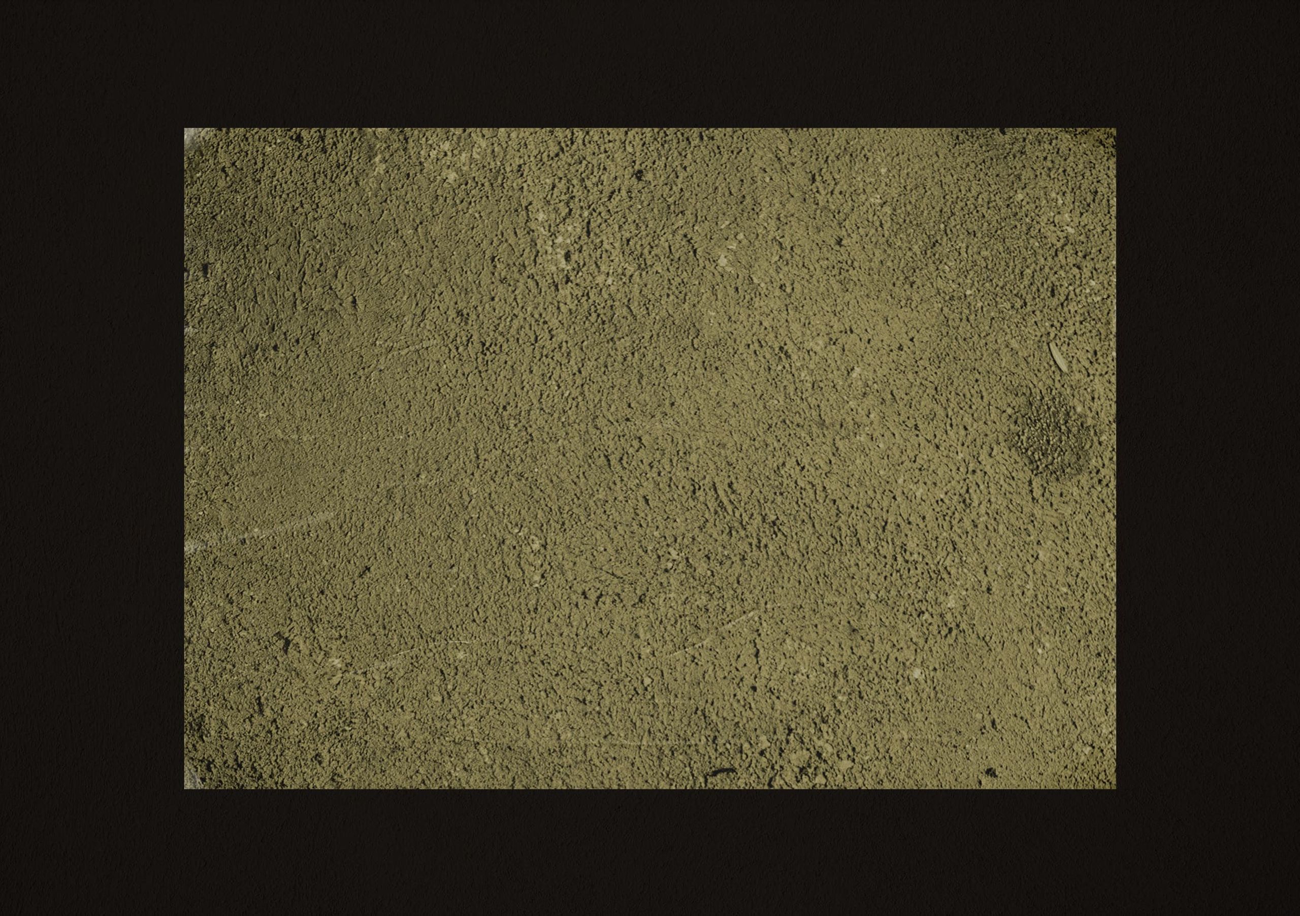
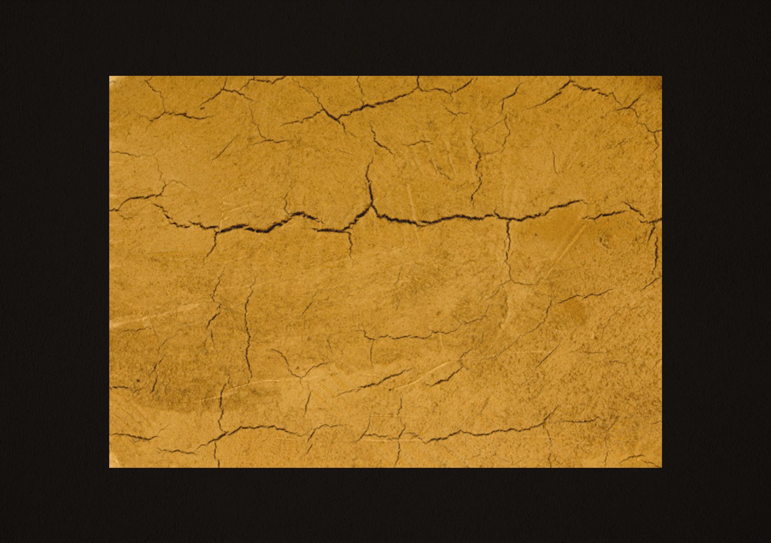
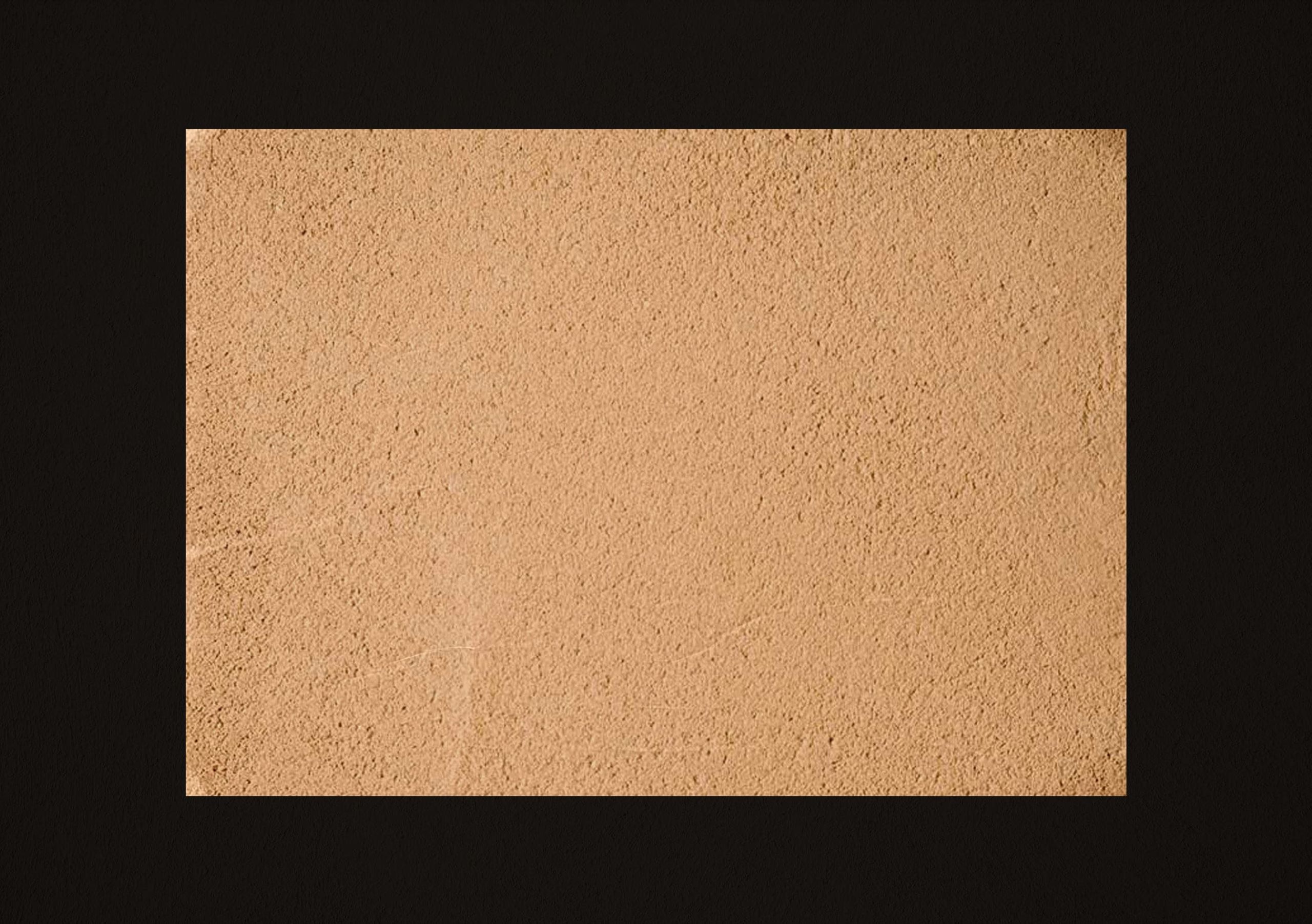
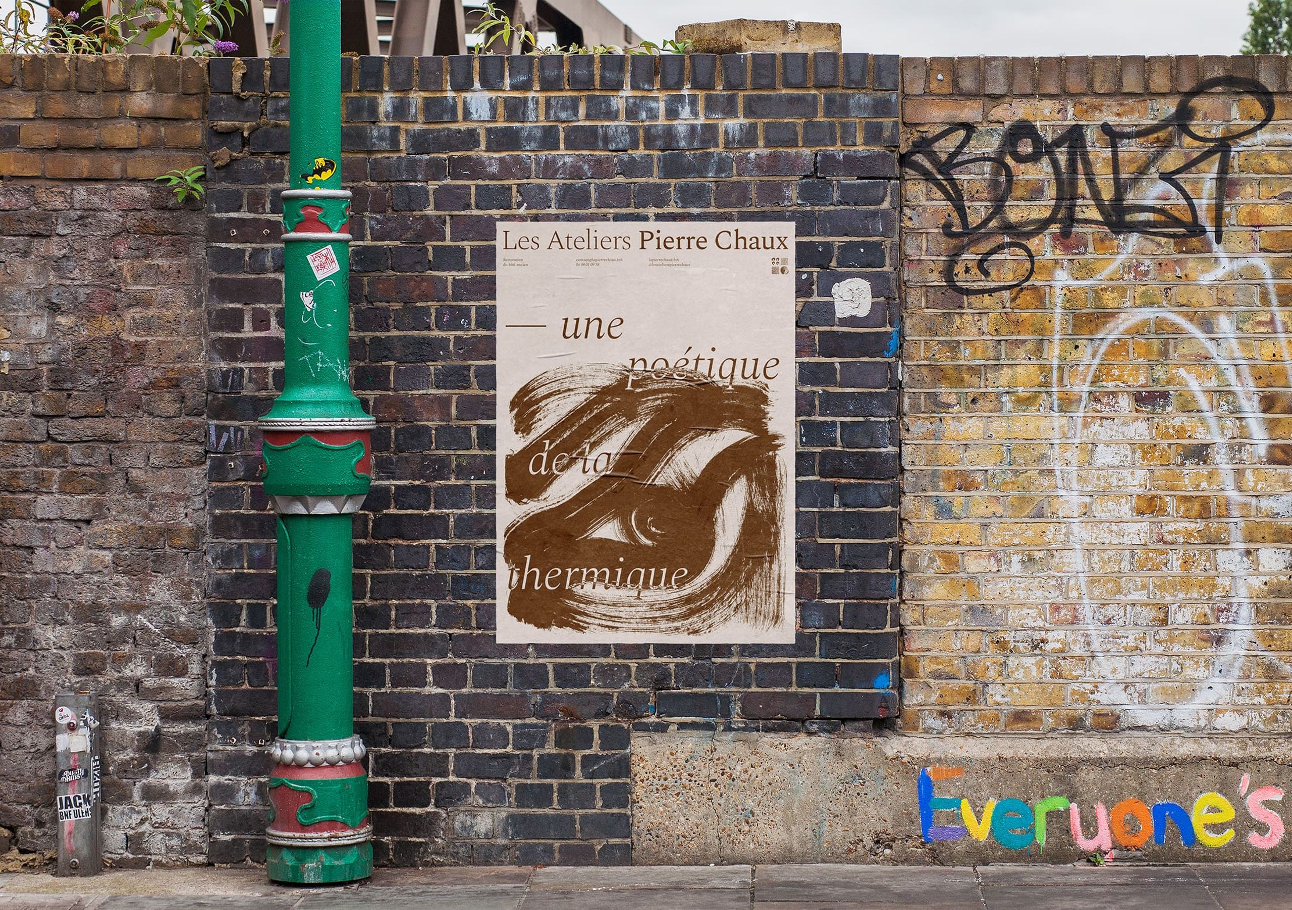
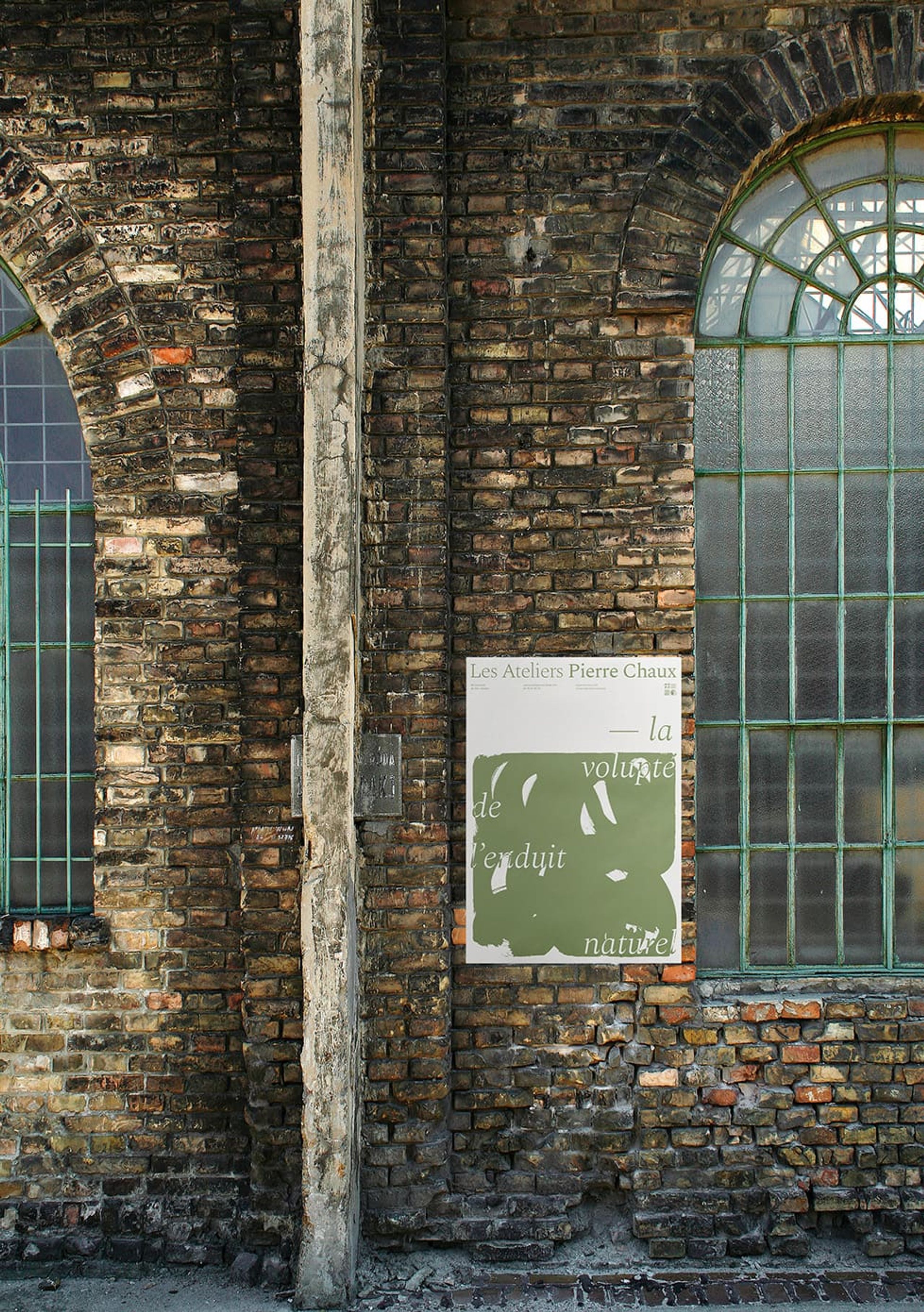
The color scheme is inspired by the natural pigments found in the materials used by Ateliers Pierre Chaux, such as clay, straw, hemp, terracotta, lime, and sand. The palette is applied to a variety of communication media, bringing color and diversity to their branding. For printed materials, natural and textured paper is used to reinforce the link with the natural materials valued by the Ateliers.
Letters Revealed
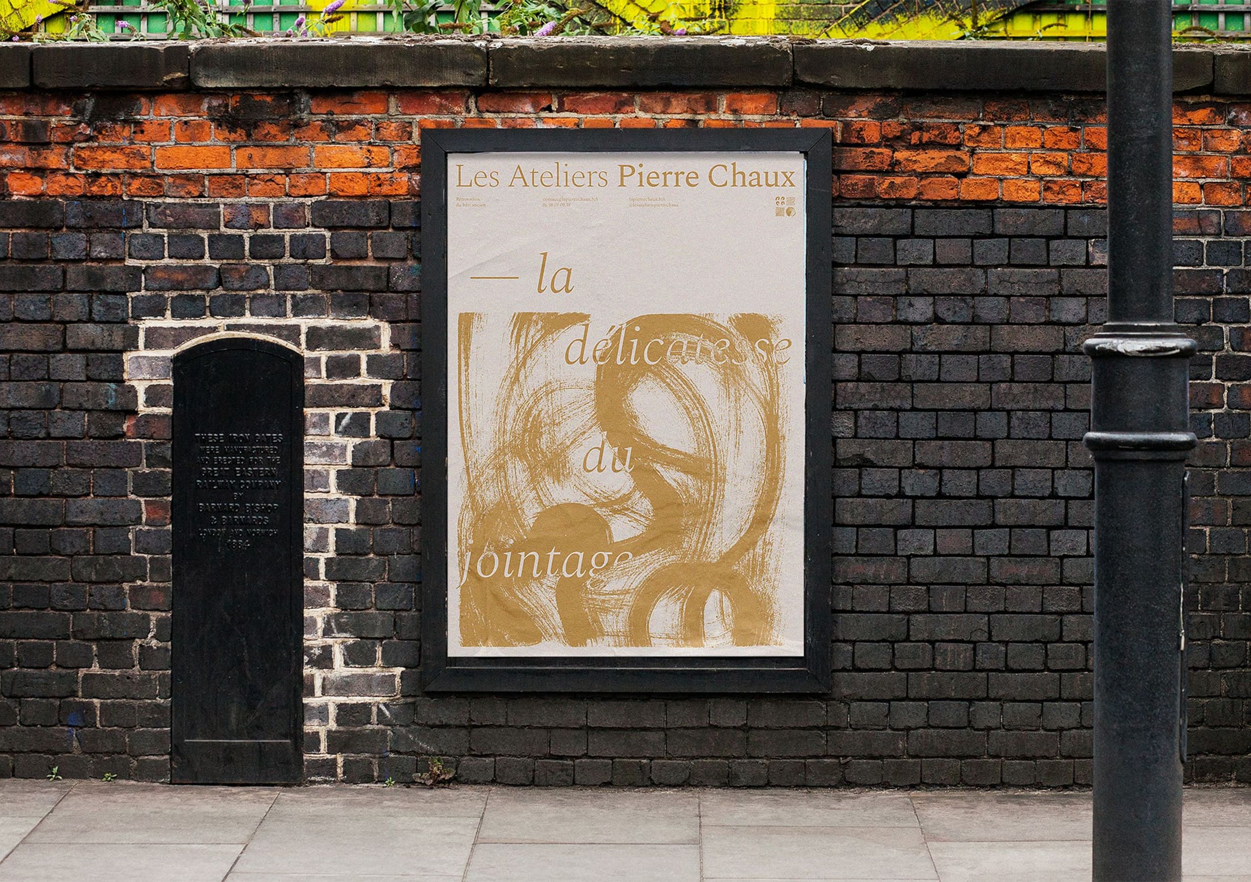
The posters feature a variety of designs, with hidden letters that are revealed in the graphic material. The poetic phrases enhance the warmth and artisanal quality of Ateliers Pierre Chaux's work.
More Information
Type in Use
- Work Sans
- Spectral
