Charte des valeurs
Details
Client
Caisse des Allocations Familiales des Côtes d’Armor
Year
2021
In drawing up its Charter of Values and Commitments, the Caisse des Allocations Familiales (CAF) has embarked on a process of collective reflection. The new charter emerged through collaborative efforts among employees to determine the values they wanted to convey.
The CAF team emphasised the creation of a visual identity centred around a primary logo, which would be expanded into five visuals representing the charter’s five values.
The Power of Connection in a Logo
The visual identity of the Charter of Values and Commitments revolves around the theme of connection—a prevalent concept within the CAF's sphere that represents unity. This idea of connection manifests in the relationships between the organisation's employees in the interactions between staff and users, and in the commitment of colleagues to their mission and shared values. Symbolised by a line, the visual identity is built as a guiding thread.
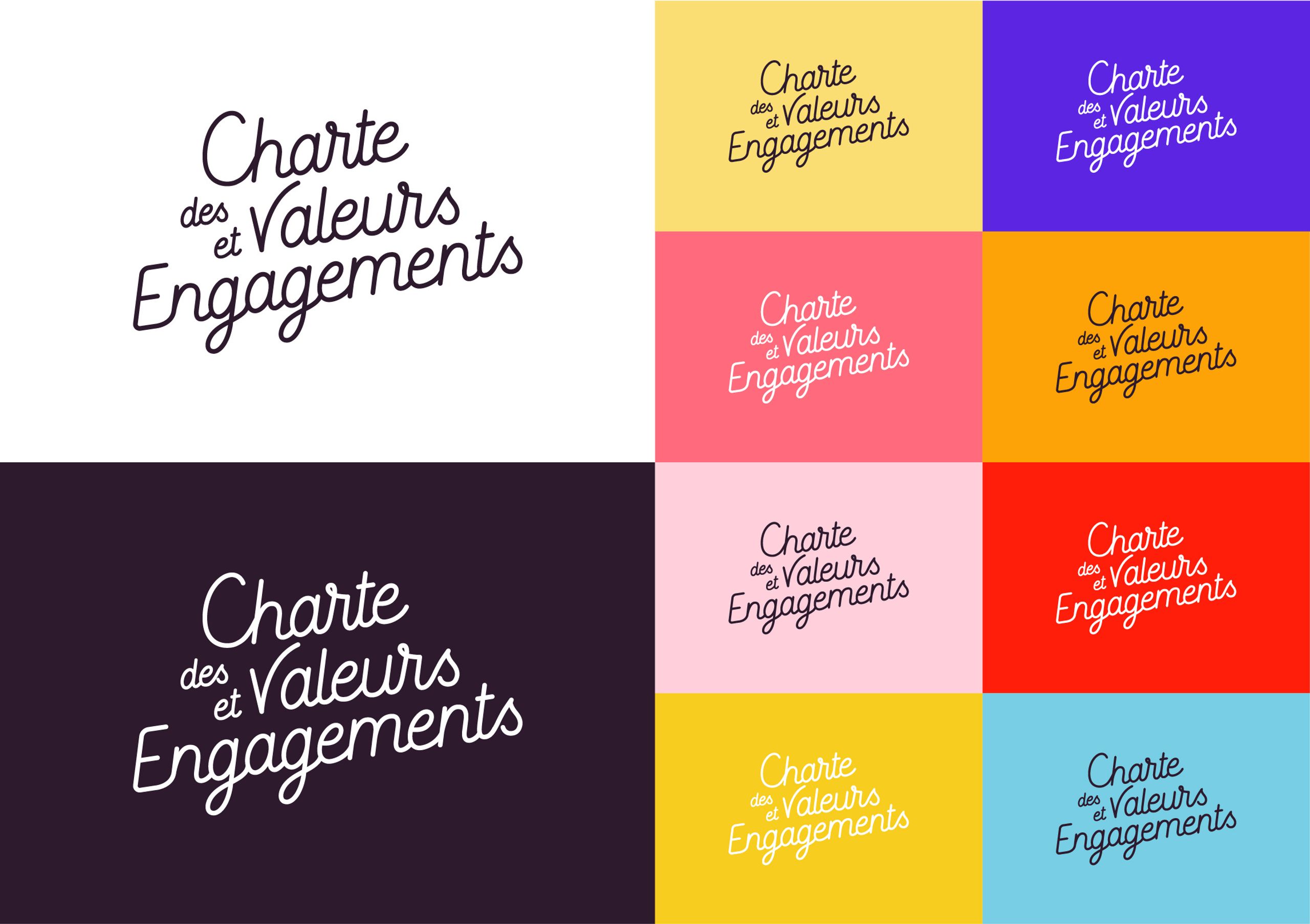
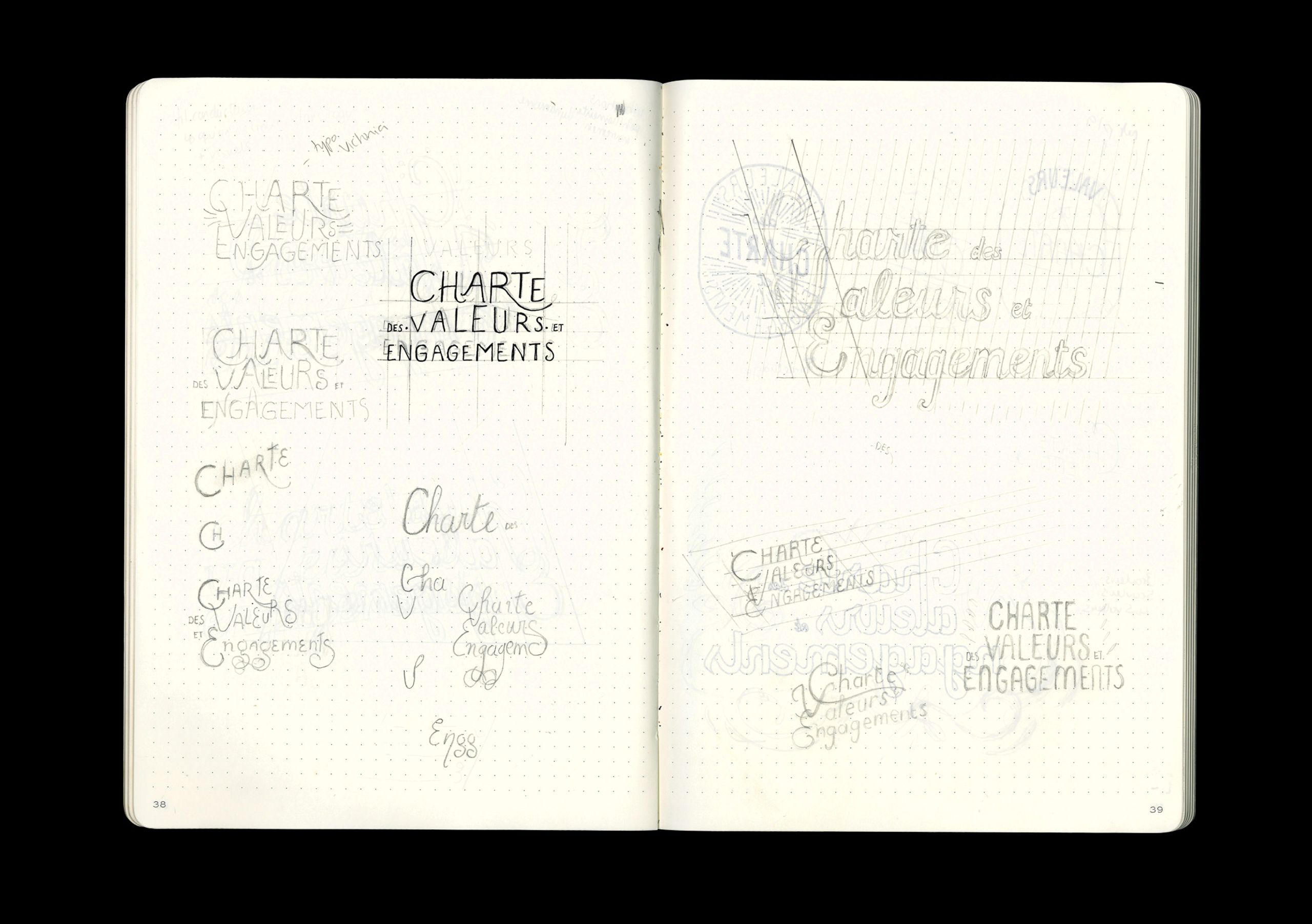
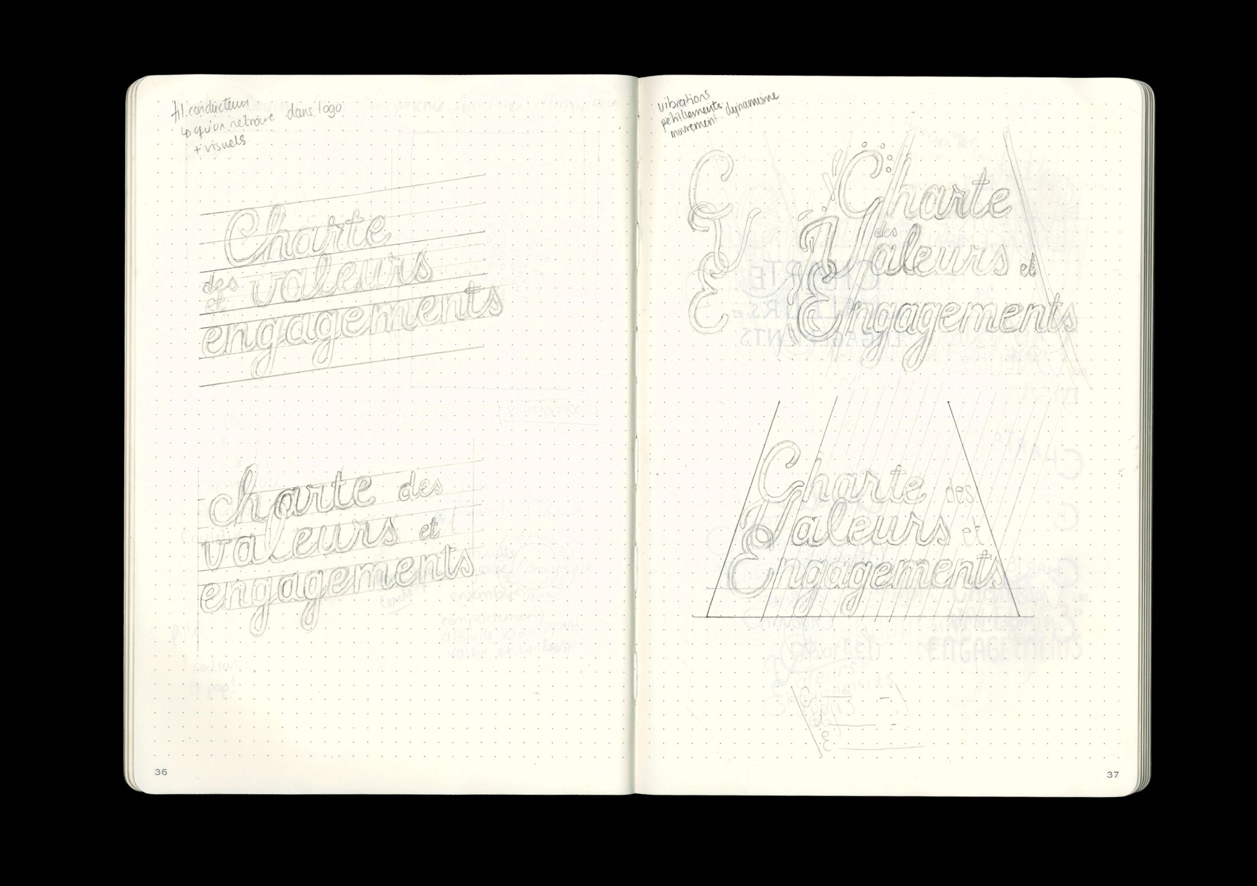
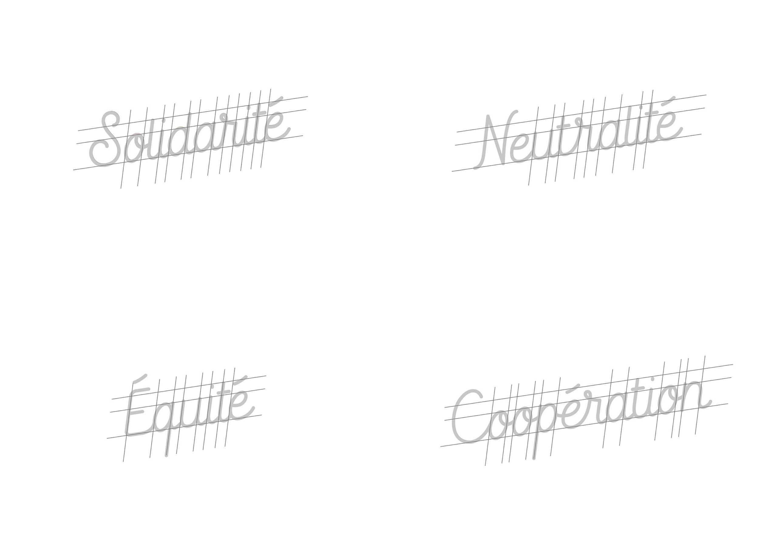
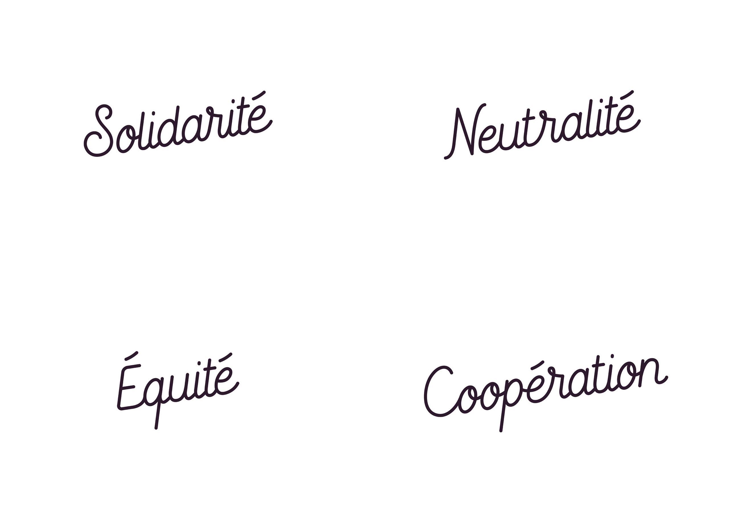
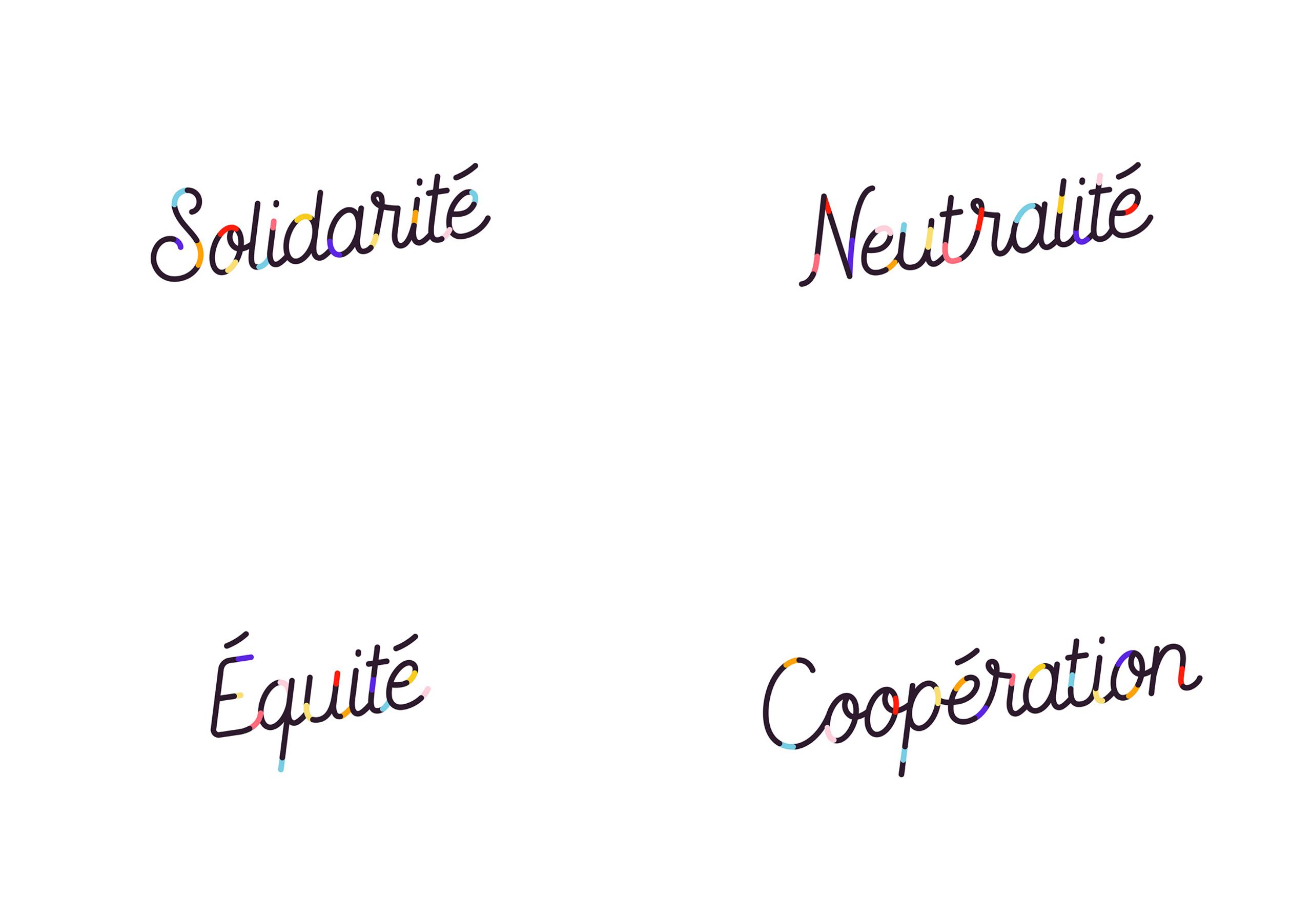
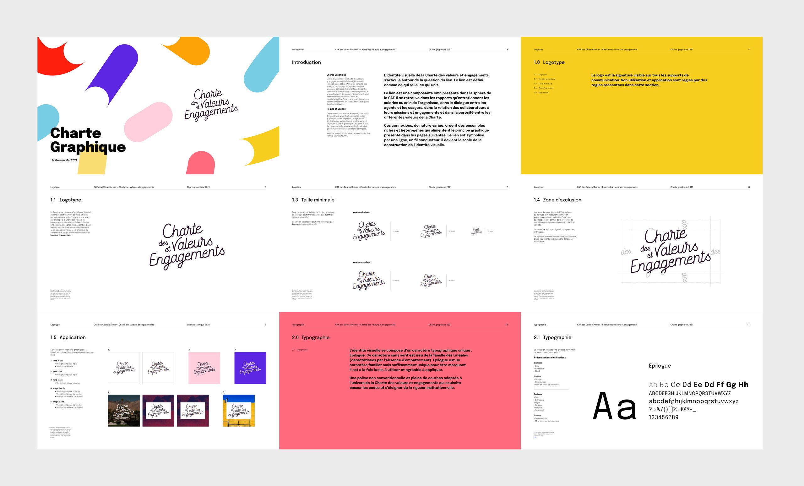
The logo features hand-drawn lettering, with flowing lines maintaining the connection between characters to emphasise the interrelation among the charter's values. The semi-calligraphic and semi-handwritten style gives it a human touch, resembling an accessible and personal signature. Simplicity instils trust, stability, and ease of memorisation. This serves as the primary logo version, with further variations to follow.
Bursts of Colours
A secondary logo version is proposed for specific applications, incorporating lines of various colours and lengths to symbolise different types of connections. These vibrant bursts of colour create dynamism and movement, acting as an expressive element to enhance the visual representation. The colour strokes serve as a visual material, adding vibrancy and energy to the design. The CAF Communication team has the freedom to play with the scale, position, orientation, and spacing of these colour strokes while ensuring overall visual coherence.
The Five Values
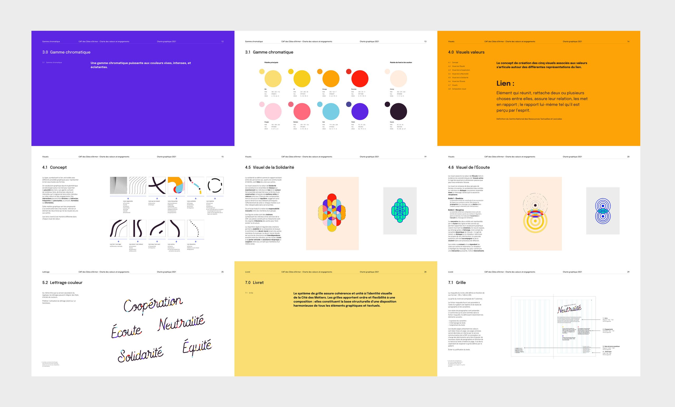
Through participatory reflection, five key values were identified for the implementation of the organisation's missions and for the daily activities’ conducted by the staff: Equality / Neutrality / Solidarity / Cooperation / Listening.
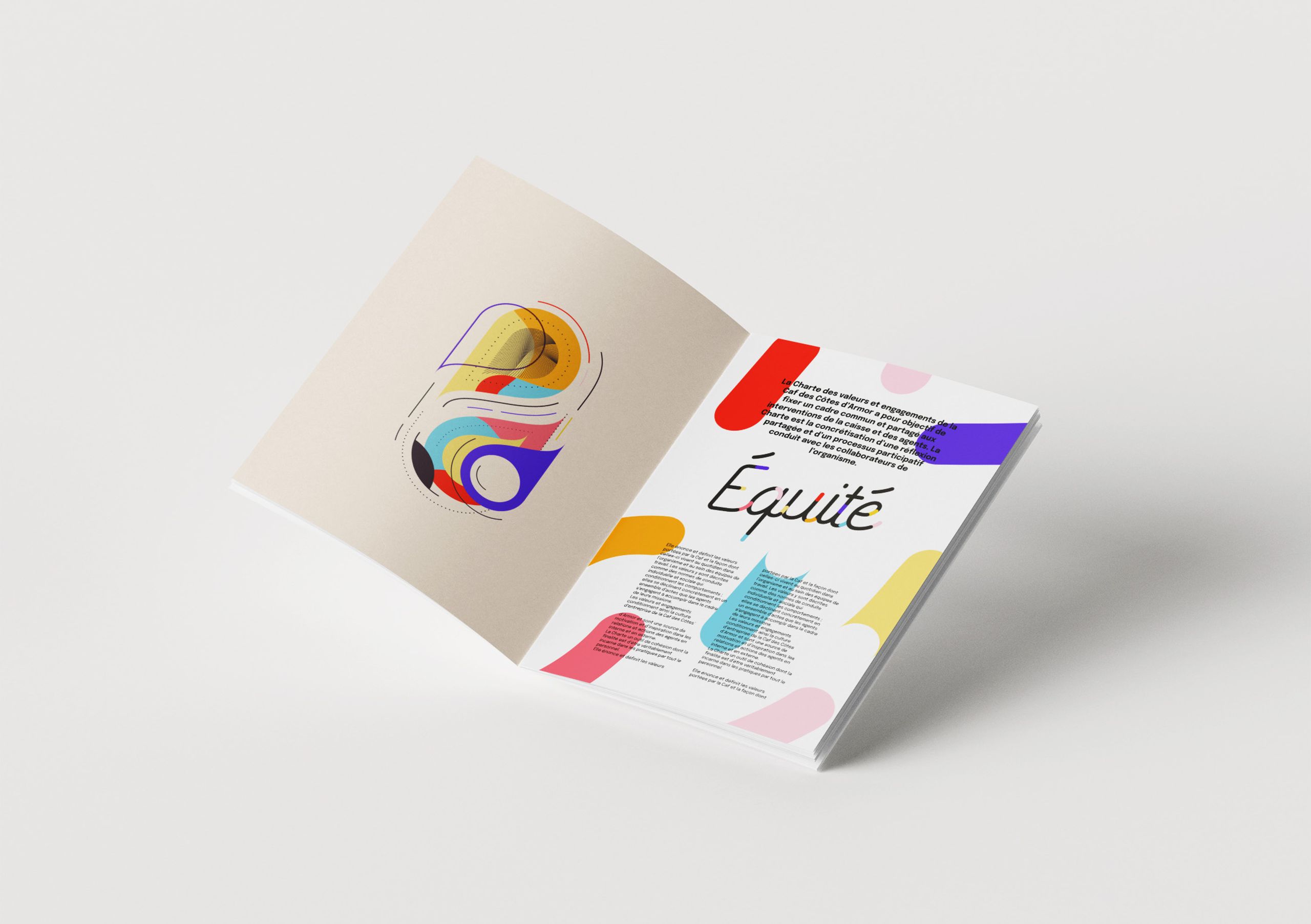
Each value is associated with a graphical representation that facilitates memorisation and evokes emotions, aiming to foster a sense of ownership of the charter among the staff. The non-figurative representations allow for inclusivity and avoid stereotypes. The charter's identity should be representative of everyone within the organisation while allowing the visuals to convey their message effectively. The abstract nature of the representations allows for a stronger symbolic impact, stimulating imagination and emotions.
The Graphic Connection
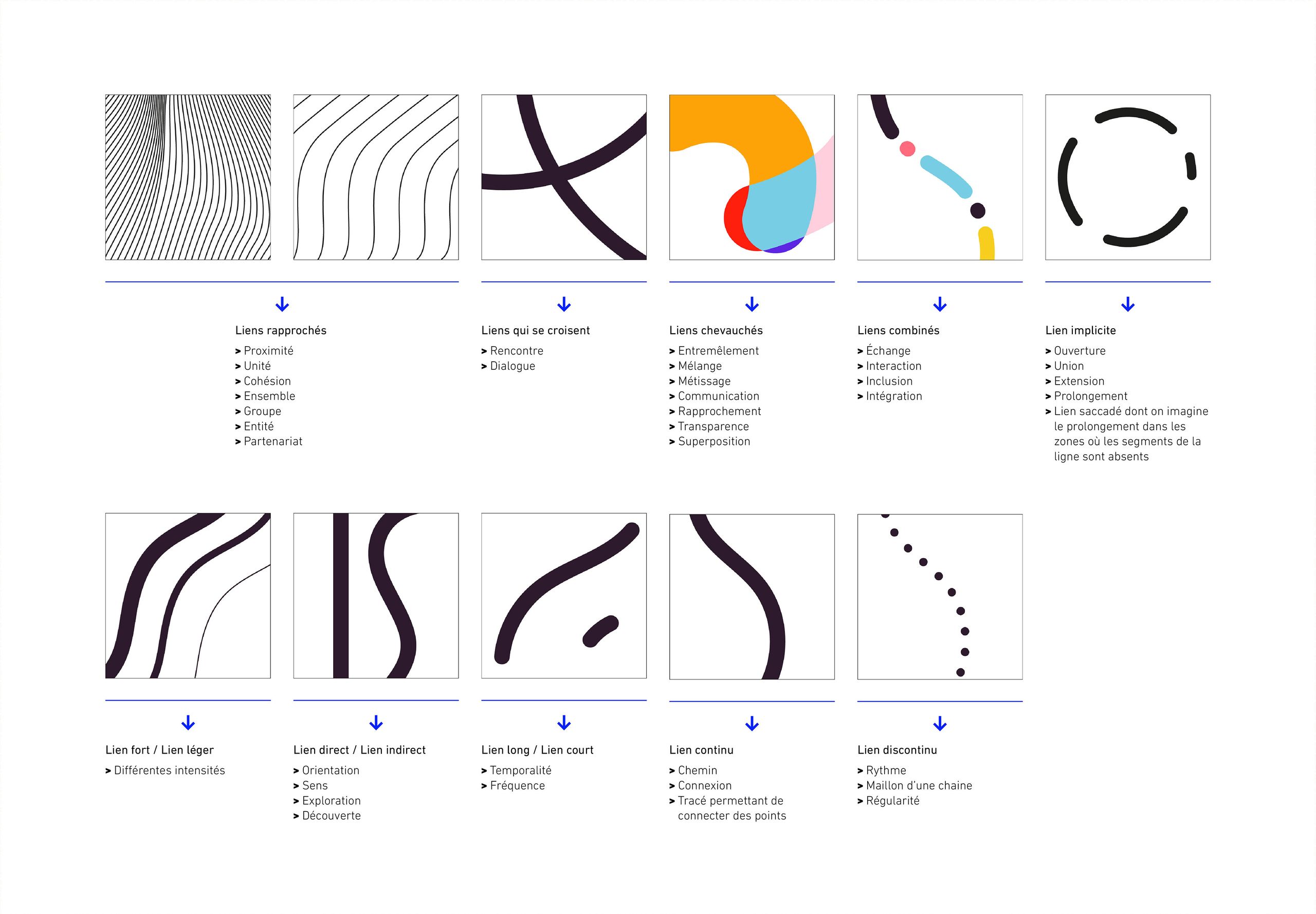
The visuals depict connections through various graphical representations. Lines are presented in diverse forms, creating a refined and geometric visual vocabulary to express the multitude of connections—between individuals, values, and commitments. This graphical framework serves as a recurring element in the construction of the five illustrations, linking them together and allowing the nature of connections to evolve uniquely within each visual representation.
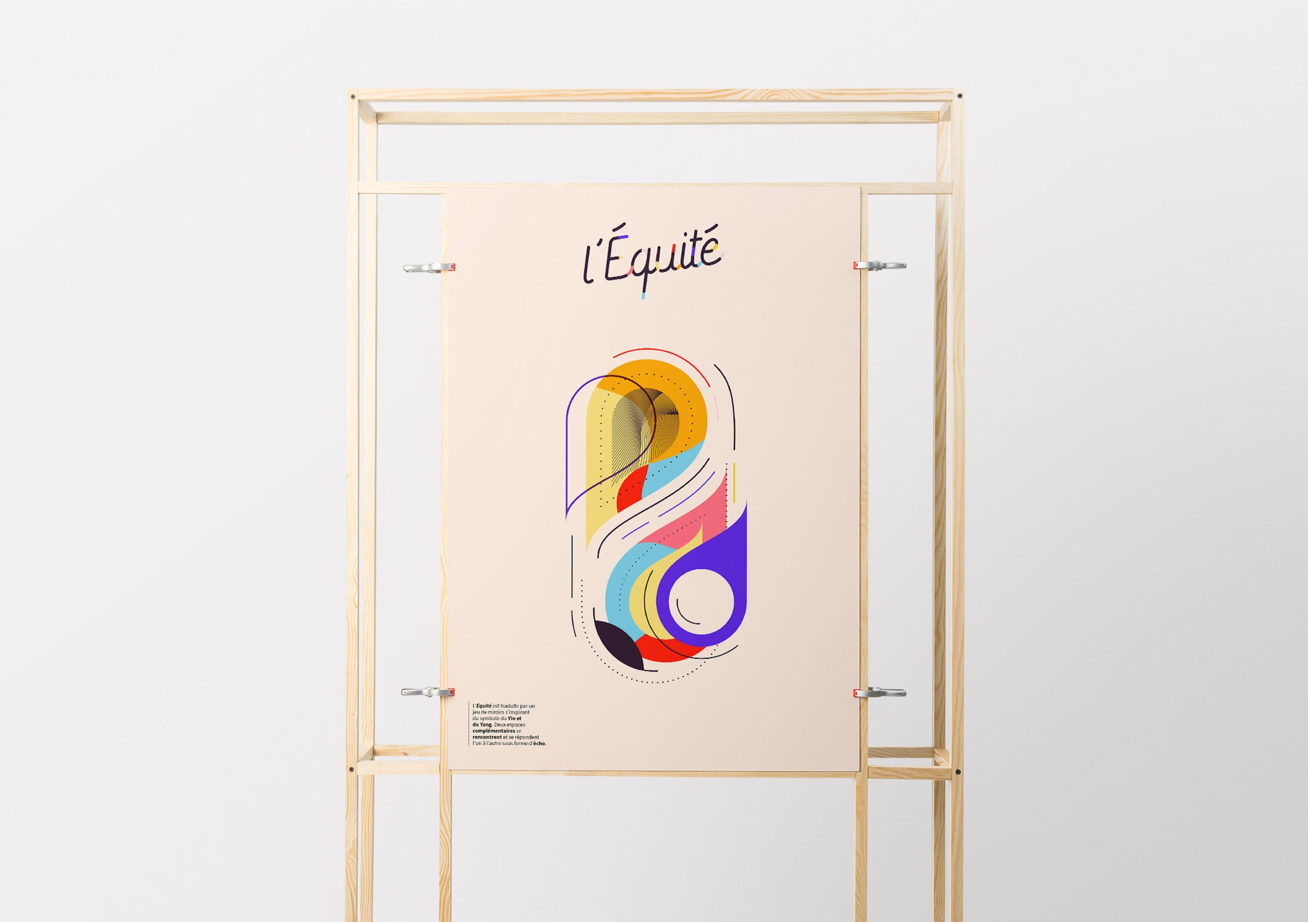
Equality
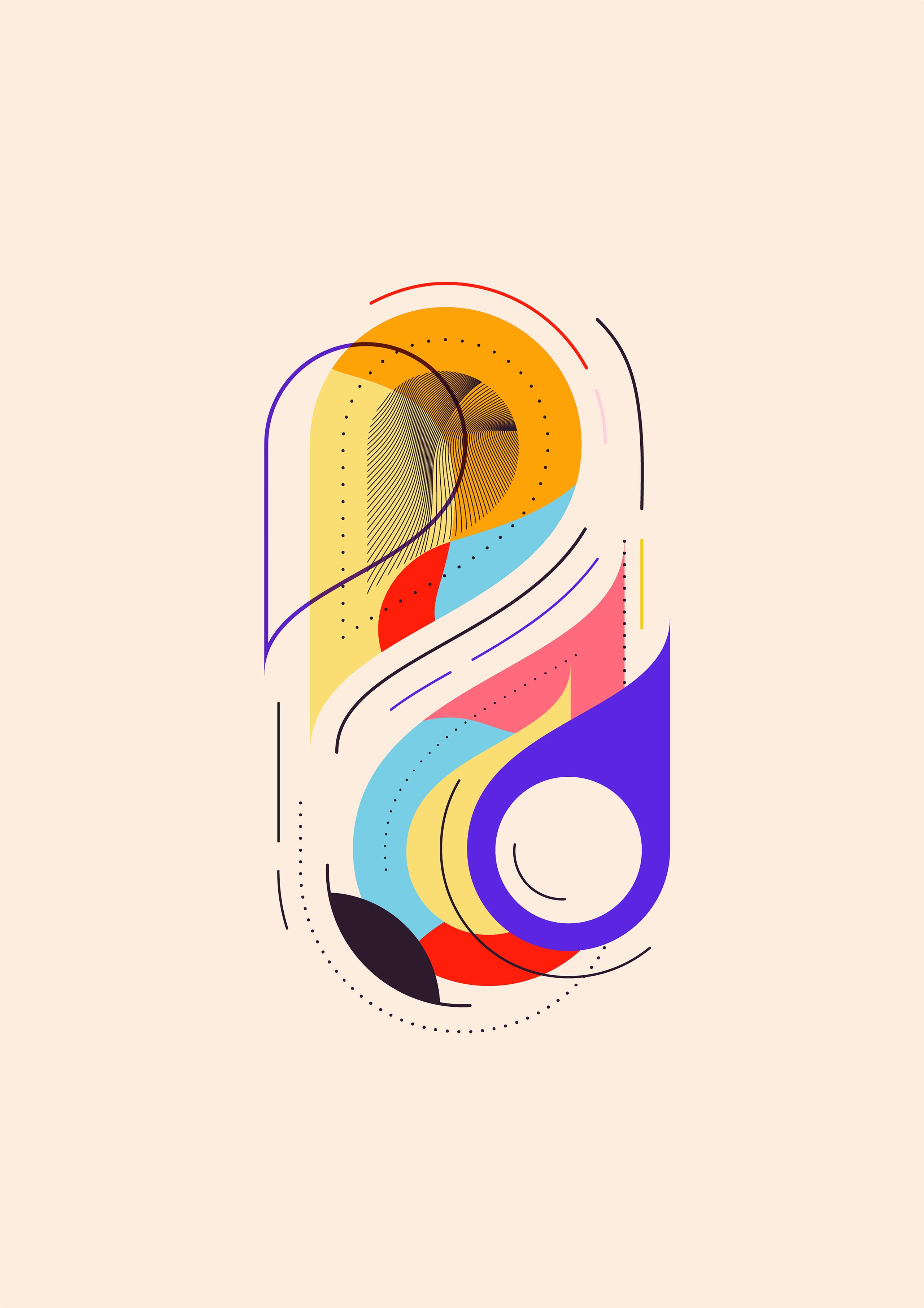
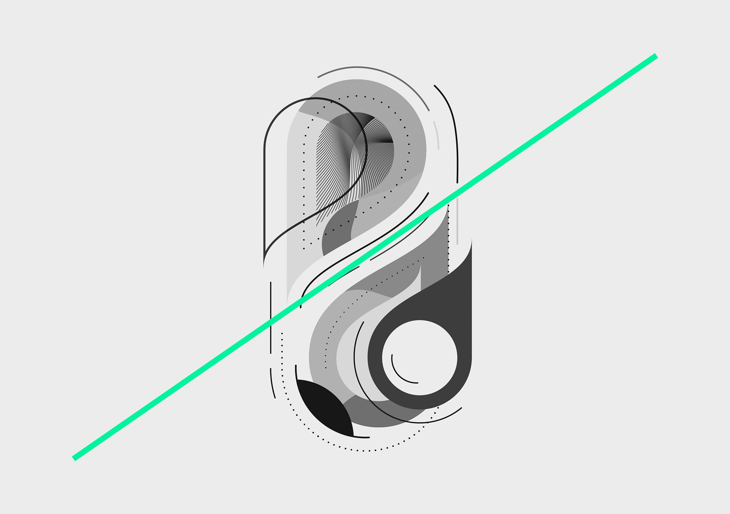
The visual structure draws inspiration from the Yin and Yang symbol. An imaginary border divides the visual, bringing two spaces together in a contrasting manner. Equality is expressed through a mirrored effect that goes beyond strict balance and emphasises resonance. The two sections establish a relationship that echoes each other, creating a sense of harmony through complementary elements. Equality is represented as an entity in its own right, composed of distinct parts, which, when brought together, form a unique whole.
Neutrality
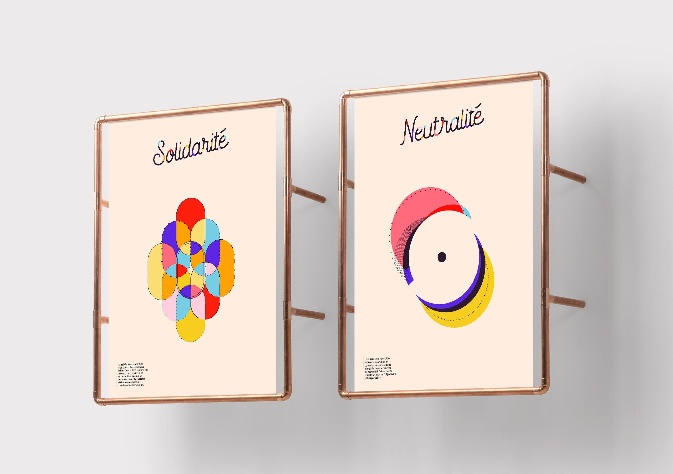
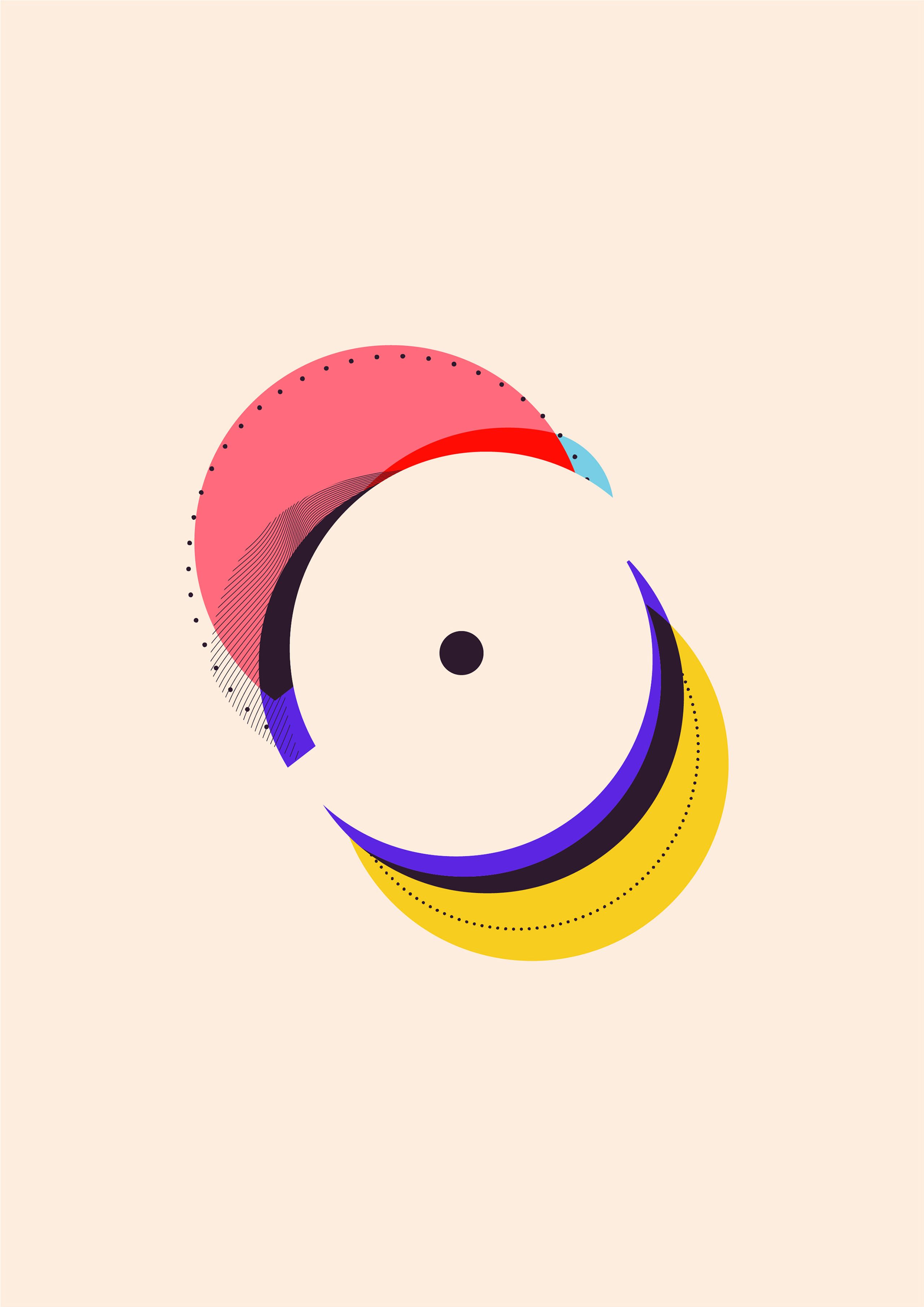
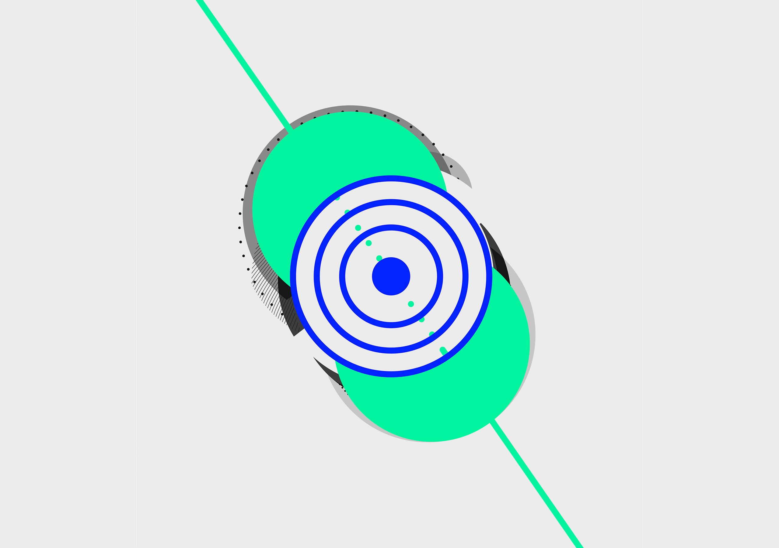
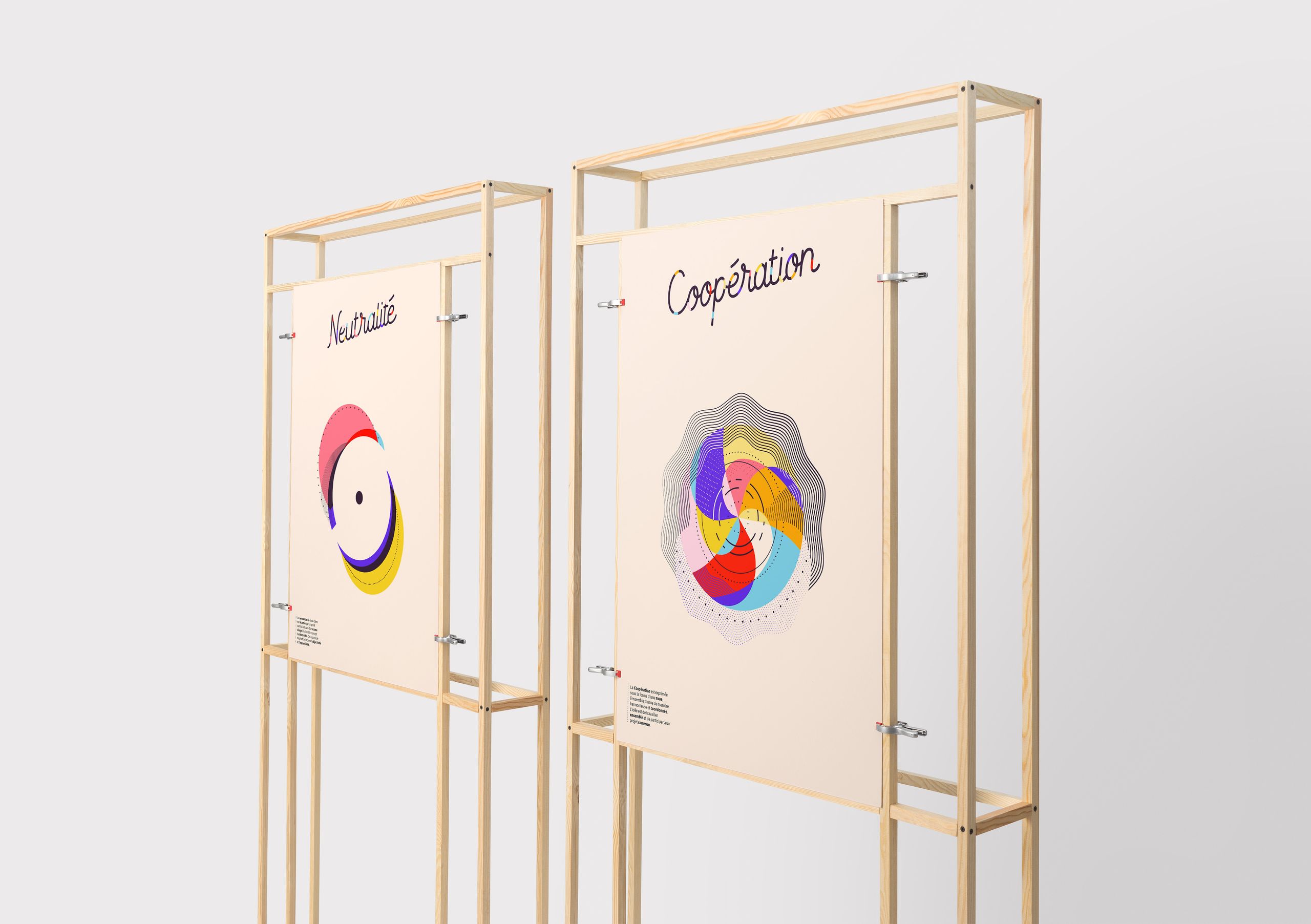
An oblique axis cuts across the visual, with colourful graphic elements arranged on either side of the diagonal, representing the convergence of two contrasting viewpoints. The central point, surrounded by a blank area, symbolises neutrality. The empty space surrounding it signifies the extension of neutrality within a defined context. This open space embodies safety, objectivity, and impartiality.
Solidarity
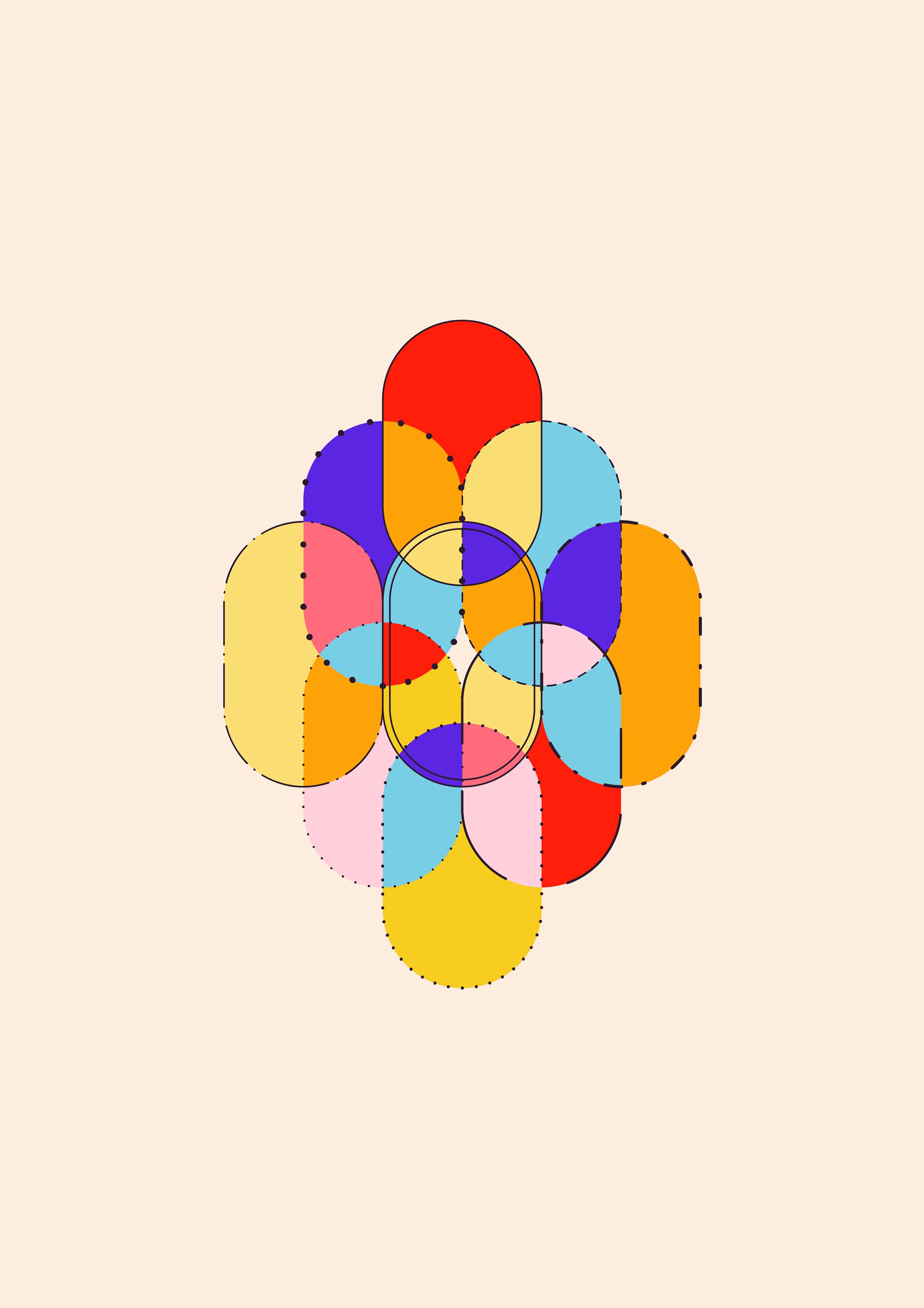
The visual composition consists of interconnected networks that keep individuals in contact. It takes shape through a series of interlocking links, with each element supporting the structure and underscoring the notion that the removal of a single element would cause the entire structure to collapse. This graphical structure visually represents the mutual responsibility among members of a group.
Cooperation
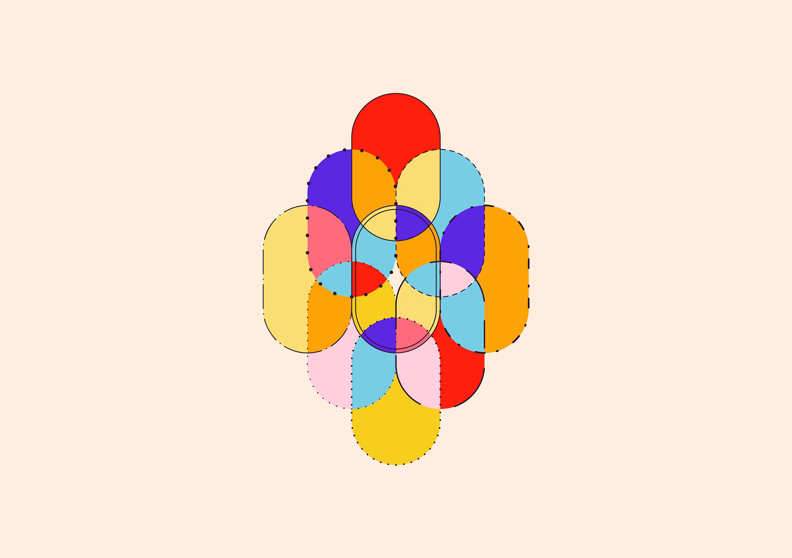
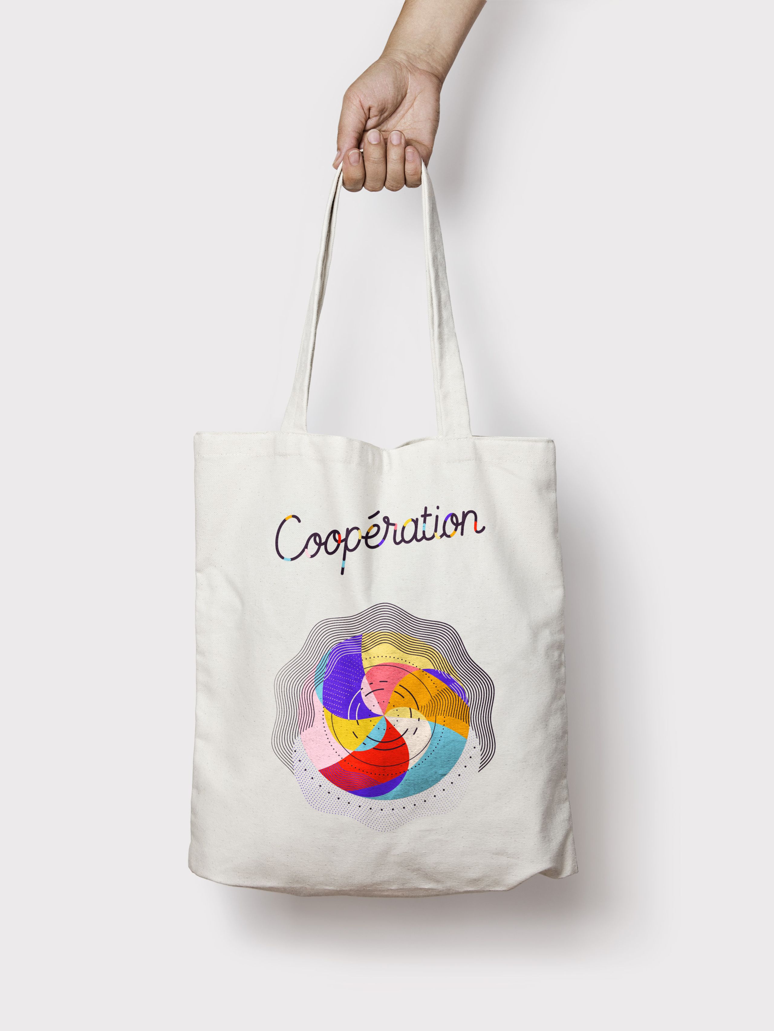
Cooperation is depicted through an arrangement of diverse elements, showcasing the diversity of ideas, personalities, and actors involved. The graphical elements are assembled, mixed, and layered, creating a blended ensemble. The composition functions like a machine composed of gears, where each piece, despite their differences, finds a balance, allowing collective functioning in harmonious and complementary unity. The circular ensemble rotates, akin to a wheel, in a synchronised and choreographed motion. In collective work and shared projects, listening to one another is essential.
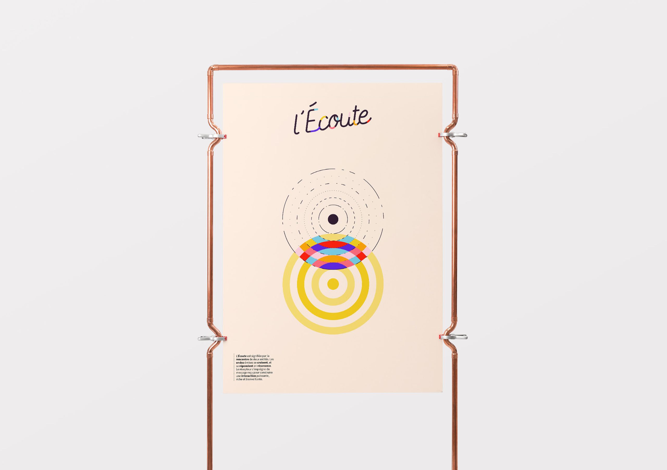
Listening
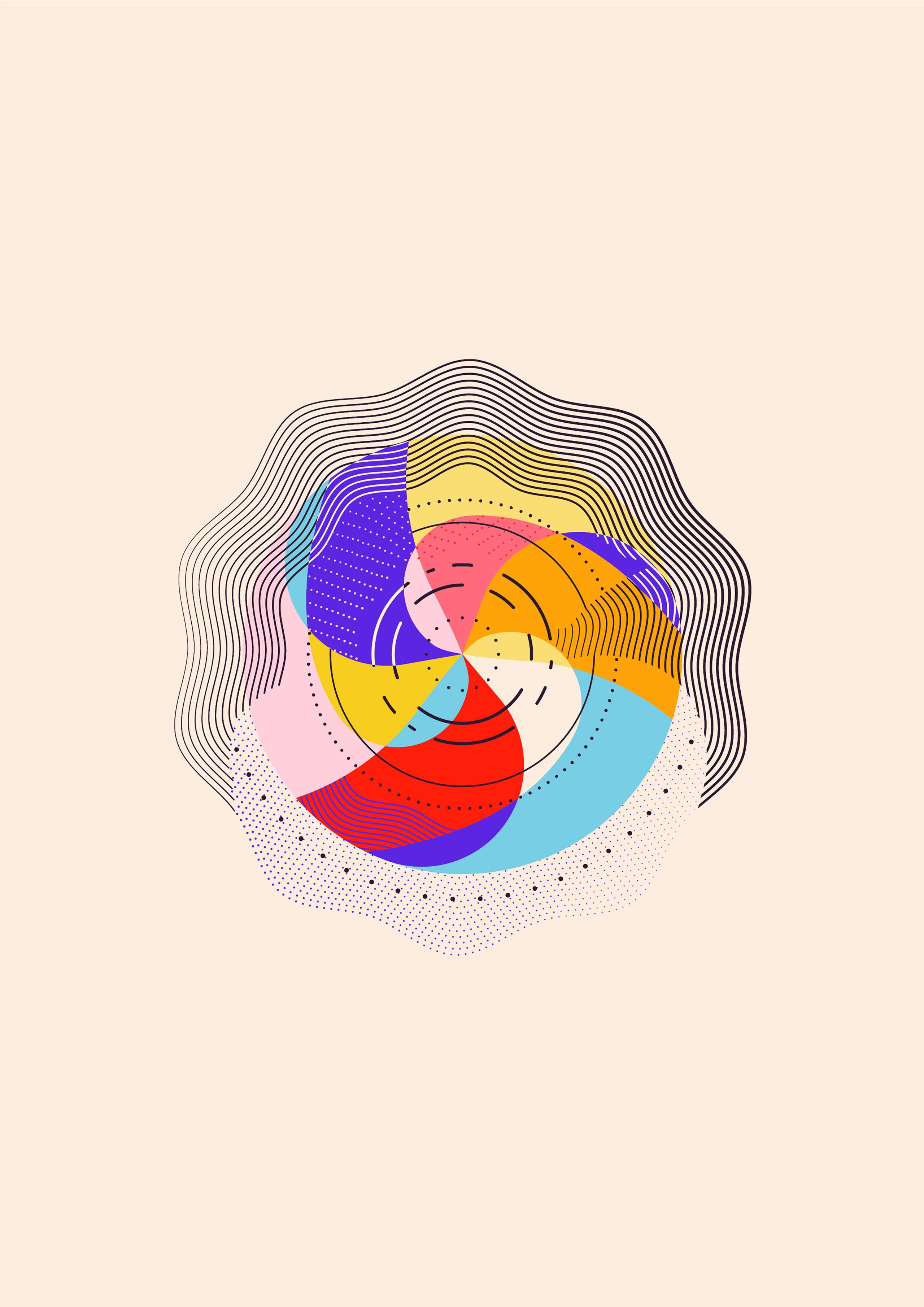
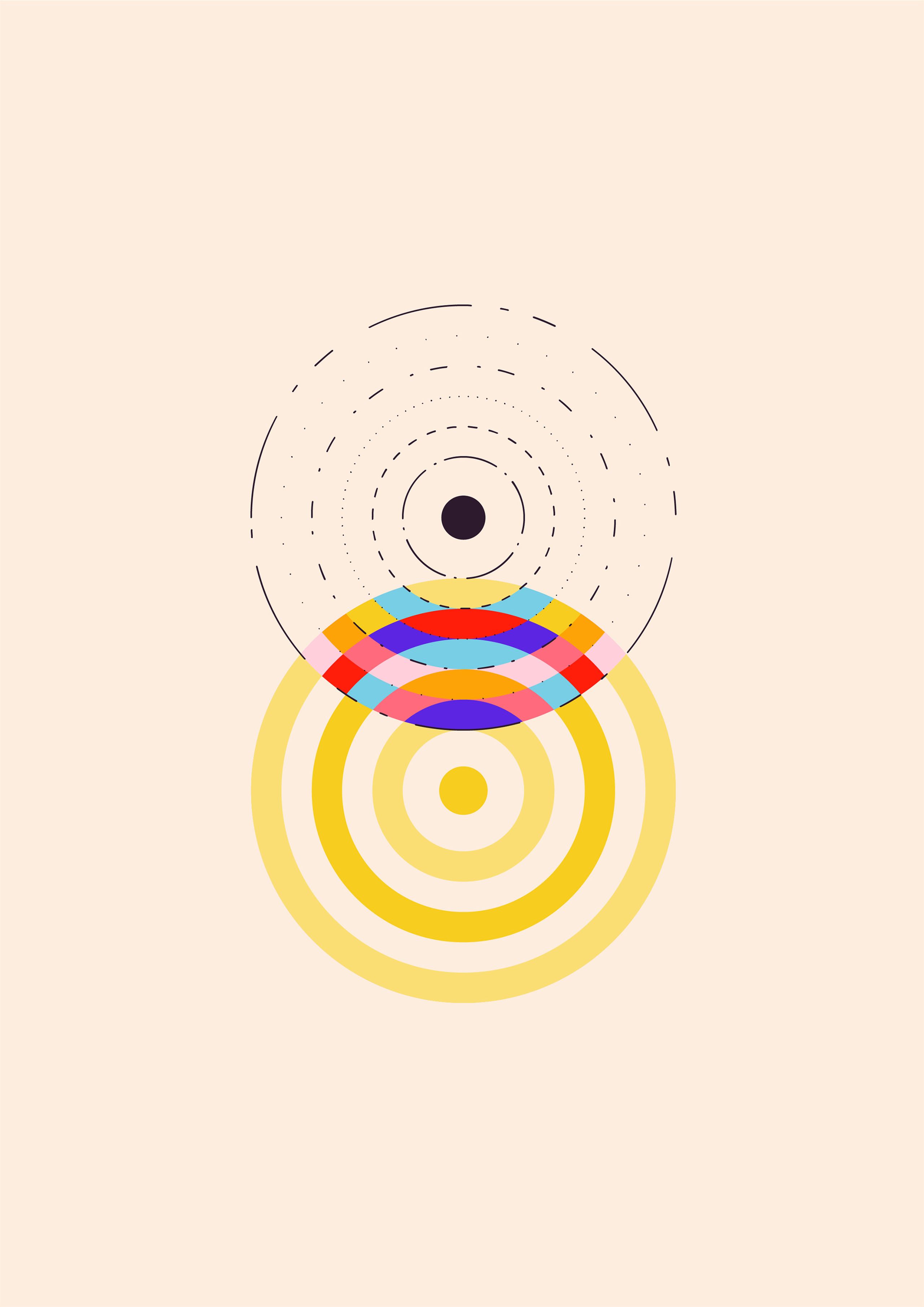
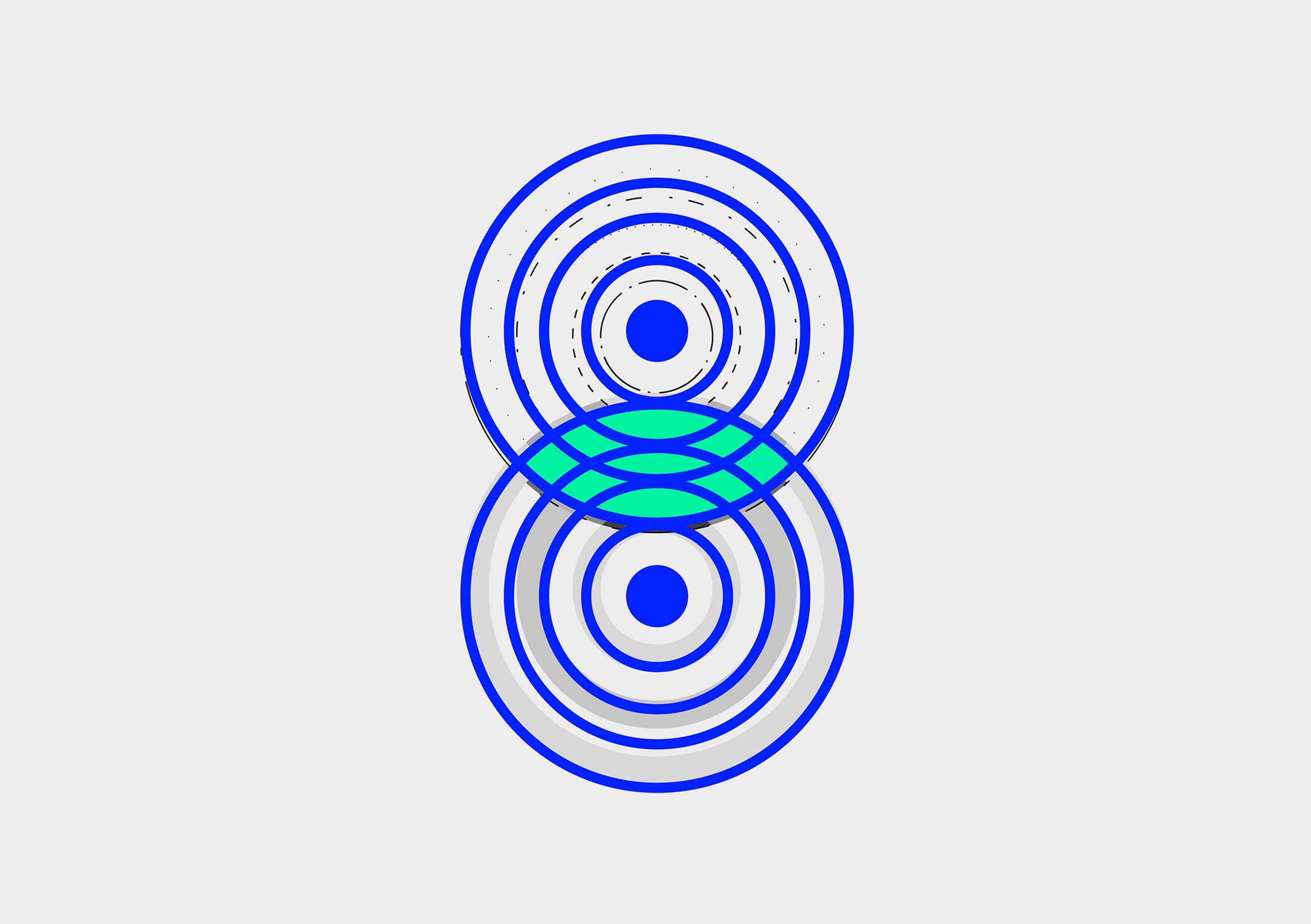
The illustration highlights the characteristics of active listening. Two groups of circular shapes symbolise entities or individuals engaged in dialogue. The first set emits a message, while the second set receives it. The meeting of the two is represented by the fusion of lines and circles, resulting in a colourful graphical vocabulary that embodies emotions. This newly formed space captures the dynamic nature of listening. Through questions and rephrasing, the receiver accompanies the interlocutor in his thought process. Waves intersect and respond to each other, creating resonance. The receiver absorbs the received message, leading to powerful, enriching, and benevolent interactions.
Lettering Variations
The characters composing the logotype have been used to create an alphabet for spelling out the words representing the five values of the Charter of Values and Commitments. These lettering variations accompany the illustrations.
The Booklet
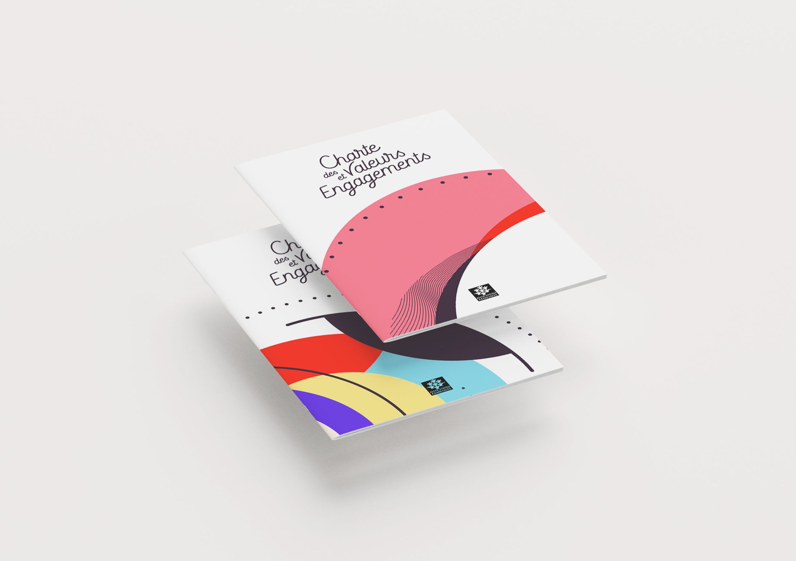
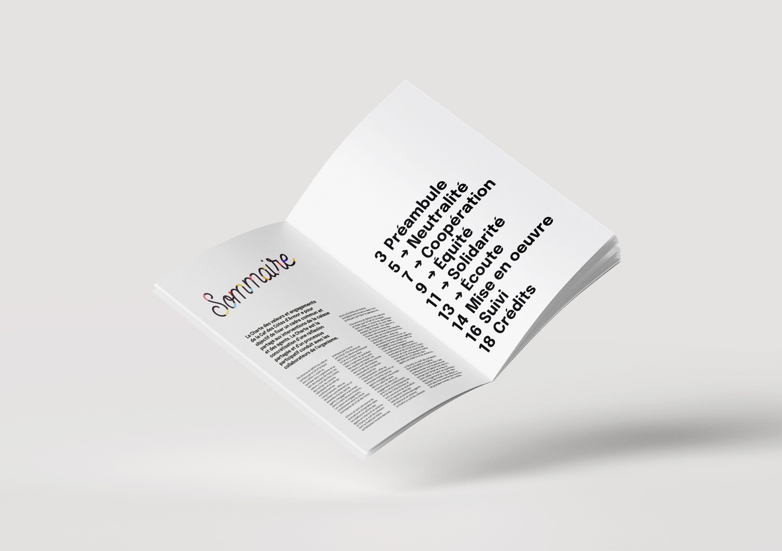
A booklet encompassing the values and internal philosophy of the CAF des Côtes d'Armor is distributed to the entire staff along with a tote bag. This booklet aims to articulate and define the organisation's values and how they manifest in the daily conduct of individual and institutional missions, as well as in team organisation.
Posters
The visuals representing the five values have also been adapted into large-format posters displayed prominently within the premises of the CAF. They are intended to be permanently exhibited in the space, embellishing the environment.
More Information
An Inclusive Process
The Charter of Values and Commitments is the outcome of a collaborative effort among CAF employees, which commenced in September 2020. Once the graphic work was underway, two visual approaches were presented to the team. To involve the employees in the decision-making process, everyone was invited to participate in an online questionnaire to choose the design concept that resonated with them the most. The identity presented below received the highest number of votes.
The aim of the request was to ensure harmony between the message and the visual representation, while fostering a sense of team membership, identification, pride, and motivation. Above all, it served as a way to recognise and appreciate the work and collaboration of the teams involved in the charter project.
Type in Use
- Epilogue
